
Scroll Accordion Widget for Elementor
On this page
The Scroll Accordion widget opens and closes a stack of accordion items automatically as the visitor scrolls the page up and down.
1. What It Does
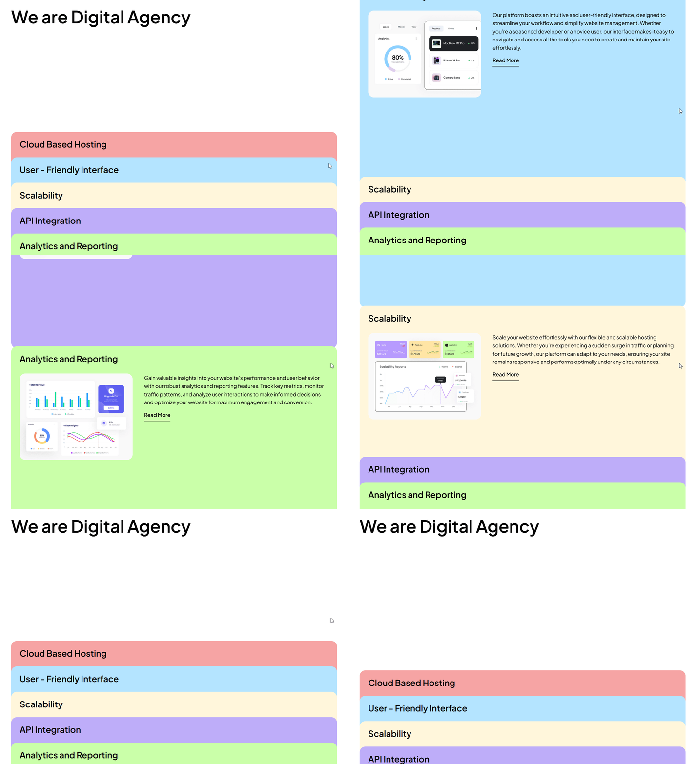
Displays a list of accordion items that expand and collapse based on scroll position, rather than on click, revealing each item’s image, description, and button as it comes into view.
2. Why It Matters
Scroll-driven accordions keep visitors engaged as they move down the page and work well for a step-by-step process or feature walkthrough that unfolds without extra clicks.
3. What You Get
A Main Title, a Content Layout choice for horizontal or vertical item content, and a Slides repeater with an image, title, description, and button per item.
4. Benefits
Skipped, already covered above: the value is the scroll-driven reveal described in Why It Matters and What You Get, restating it here would not add anything new.
5. Capabilities
- Main Title field for the section heading
- Content Layout dropdown, horizontal or vertical item content
- Slides repeater, each item with Title, Description, Select Image, Button text, and Url
- Content Style dropdown for a pre-defined visual style
6. How It Works
As the visitor scrolls, each Slides item opens in turn based on its position in the viewport, and the previous item closes, confirmed live via the widget’s scroll-linked JS.
7. How to Use It
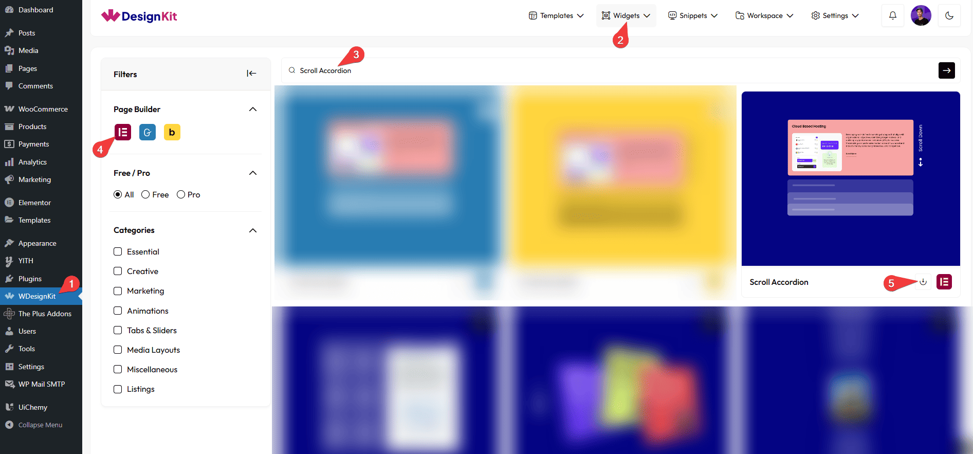
- Activate the Scroll Accordion widget from WDesignKit’s Ready Widgets.
- Drag the widget onto the page and set the Main Title.
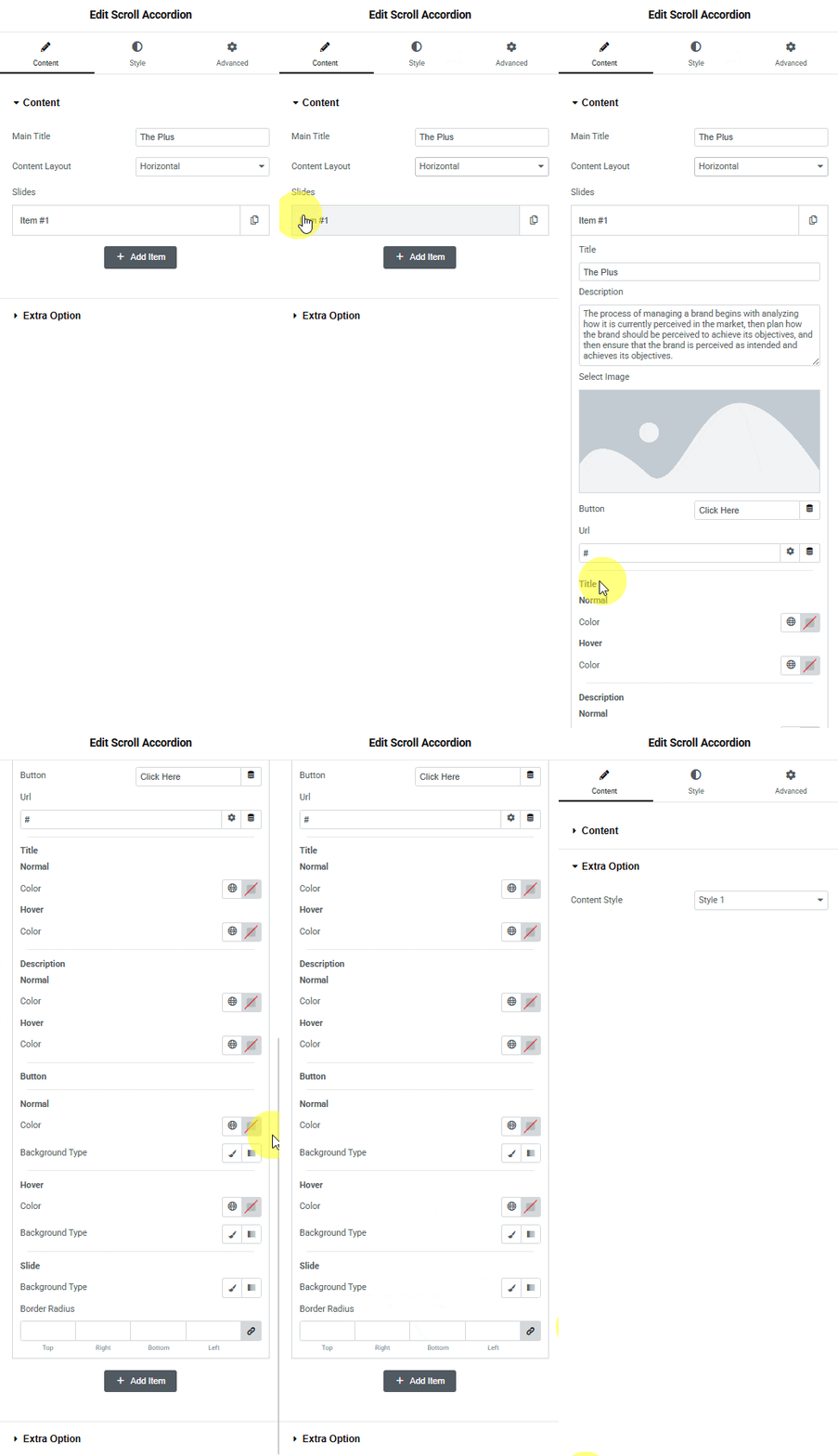
- Choose a Content Layout, then add items under Slides, each with its own Title, Description, Select Image, Button text, and Url.
- Pick a Content Style from Extra Option, then scroll the page to preview the open and close effect.
8. Use Cases
- A step-by-step how-it-works section that reveals each step on scroll
- A feature list where each feature gets its own image and description as the visitor scrolls past
9. Limitations
- The open and close timing follows scroll position, it cannot be set to a fixed auto-play timer.
- Content Layout applies to every Slides item at once, individual items cannot mix horizontal and vertical layouts.
10. Troubleshooting
- Items do not open on scroll: confirm the widget has enough vertical space on the page, a very short container can prevent the scroll trigger from firing correctly.
- Image is missing from an item: Select Image has no default placeholder shown once content is added, confirm an image was actually chosen for that Slides item.
- Layout looks off after adding items: Content Layout is a page-wide dropdown for the widget, re-check it if a new item was added with different expectations than the existing ones.