
Button Border Animation Widget for Elementor
On this page
The Button Border Animation widget adds a button with an animated border that draws around its edge.
1. What It Does
Displays a button whose border animates around its perimeter continuously or on hover, in a color and thickness you control.
2. Why It Matters
A moving border draws the eye to a call-to-action button without relying on a background color change, useful on a hero section where the button needs to stand out over a busy background.
3. What You Get
A configurable button with text, an optional icon, a link, and Style tab controls for the animated border’s color and size.
4. Benefits
Skipped, already covered above: the value is the animated border effect described in Why It Matters and What You Get, restating it here would not add anything new.
5. Capabilities
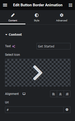
- Text field for the button label
- Select Icon field for an optional icon
- Alignment control per responsive device
- Url field for the button’s link
- Style tab controls for the animated border’s color and size
6. How It Works
The border runs a continuous animated line around the button’s edge using the color and size set on the Style tab, independent of the button’s fill and text color.
7. How to Use It
- Activate the Button Border Animation widget from WDesignKit’s Ready Widgets.
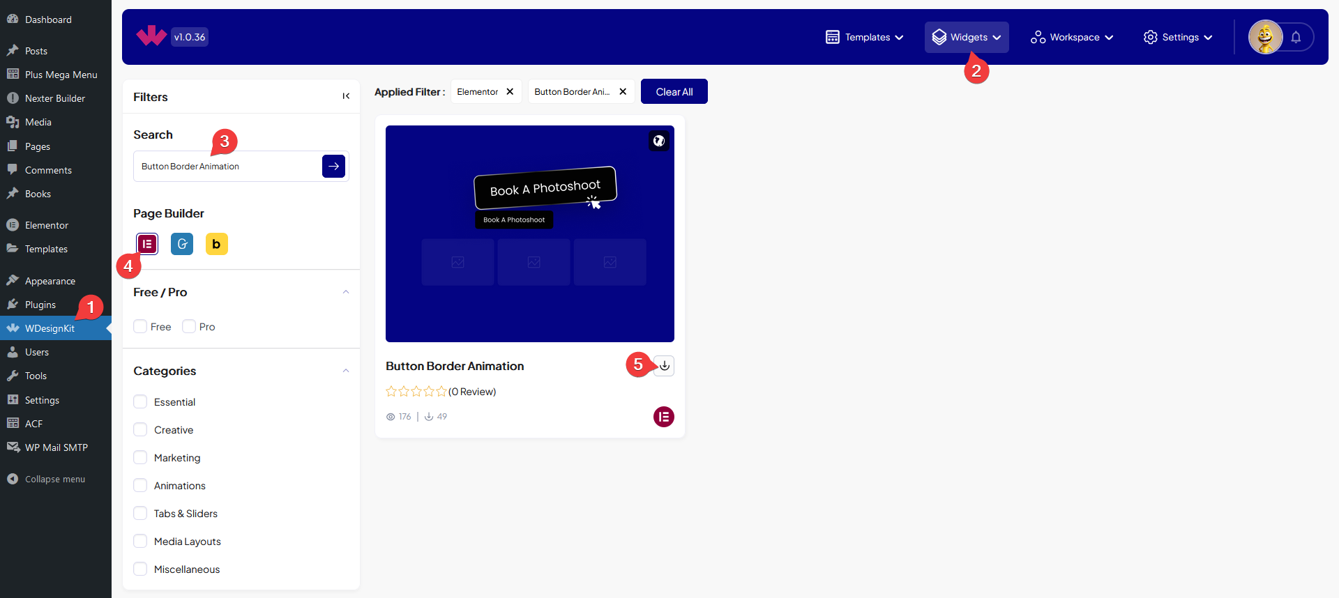
- Drag the widget onto the page, set the Text, optionally add a Select Icon, then set Alignment and the Url.
- Set the animated border’s color and size from the Style tab.

8. Use Cases
- A primary call-to-action button in a hero section that needs extra visual attention
- A limited-time offer button where the moving border signals urgency
9. Limitations
- The border animation runs continuously, there is no built-in option to trigger it only on hover.
- Only one border color and size apply per button, the animation cannot cycle through multiple colors.
10. Troubleshooting
- Border animation is not visible: check the border size is not set to zero on the Style tab.
- Icon does not appear: confirm Select Icon has an icon chosen, the field has no default icon.
- Button link does not work: confirm the Url field has a complete address including https://.