
How to Create Custom Elementor Widget using Free WDesignKit Widget Builder?
On this page
What It Does
The WDesignKit Widget Builder lets you create a fully custom Elementor, Nexter Gutenberg, or Bricks widget from your own HTML, CSS, and JS — no plugin development required. You write or paste your layout code, wire up editable fields using drag-and-drop controls, and it becomes a real widget in the page builder’s panel.
Note: We are showing the Elementor widget here but the process remains the same for Nexter Gutenberg and Bricks as well.
Why It Matters
Ready-made widgets cover common cases, but not every layout. If you found a design on Codepen, built something bespoke for a client, or need a widget that doesn’t exist yet, this is the difference between “close enough” and exactly what you designed — without hiring a developer or learning the Elementor widget API.
What You Get
- A 3-panel builder: Code Editor (HTML/CSS/JS), Layout, and Controller panels
- 30+ drag-and-drop controls covering data input, dynamic content, media, and style groups
- A live preview before you publish
- The option to push your finished widget to the public WDesignKit library for other users
Benefits
- Skips hiring a developer or learning the Elementor widget API — the builder turns HTML/CSS/JS you already have into a real, working widget.
- One workflow for every builder: the same Code Editor → Layout → Controller process applies whether the target is Elementor, Bricks, or Nexter Gutenberg.
- A widget you build for one project becomes reusable — push it to the public library, or duplicate it, instead of rebuilding the same component from scratch next time.
Capabilities
Data Controls (single value)
| Control | Use it for |
|---|---|
| Text / Textarea / WYSIWYG | Editable text content, plain or rich |
| Number / Slider / Dimension | Numeric or unit-based values (size, spacing) |
| Select / Select2 / Choose | Single choice, multi-select, or icon-style choice |
| Color | Color picker with Alpha + Global Color support |
| Media / Gallery | Single image/video/SVG, or a multi-image gallery |
| Repeater | A repeatable group of other controls |
| Code | Lets end users add their own HTML/CSS/JS in the widget |
| Switcher / Popover / Hidden | Toggle a state, group controls in a popup, or pass a hidden value |
Dynamic Controls
| Control | Use it for |
|---|---|
| Post Listing / Product Listing | Pull in posts or WooCommerce products by type, ID, or taxonomy |
| Select Template | Let users choose an existing Elementor template |
| Taxonomy | Select a taxonomy + post type combination |
Style Group Controls
| Control | Use it for |
|---|---|
| Typography / Border / Background / Box Shadow / Text Shadow / CSS Filter | Full Elementor-native style groups, applied via Selectors |
| NormalHover | Style different states (normal/hover/active) of one element |
UI-Only Controls (no output value)
| Control | Use it for |
|---|---|
| Heading / Divider / RawHTML / Preview | Organize the panel itself — labels, dividers, inline notes, live preview |
How It Works
Drag and drop any control from the Controller panel to the Layout panel. Its relevant unique name appears in the right sidebar of the HTML tab. Add your HTML code, place the cursor where you want the control, and click its unique name to insert it.
n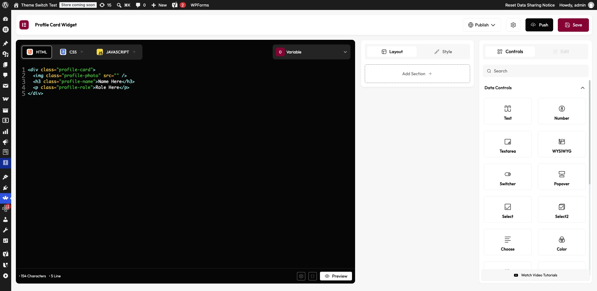
How to Use It
Create the Widget
- Elementor FREE plugin installed & activated (or Bricks / Nexter Gutenberg, depending on target builder)
- WDesignKit plugin installed and activated
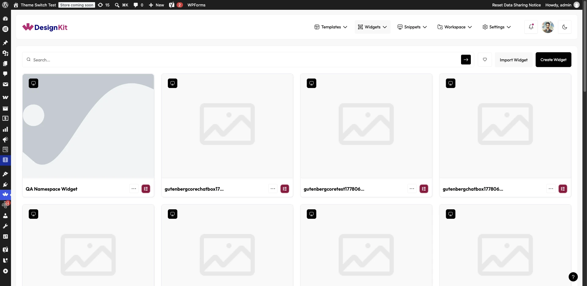
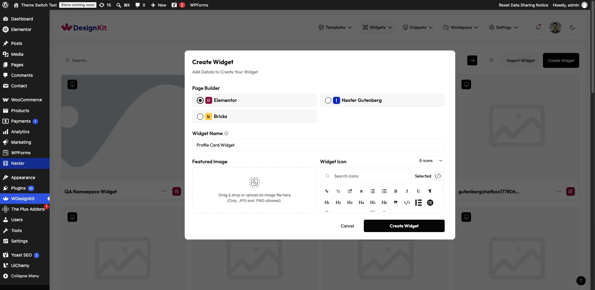
To use the WDesignKit widget builder from the Dashboard, go to WDesignKit → Widgets → My Widgets. Here you’ll find all of your custom widgets. If you haven’t created any widgets yet, click the Create Widget button.
Now a popup will open, here you’ll have to fill in your widget details:
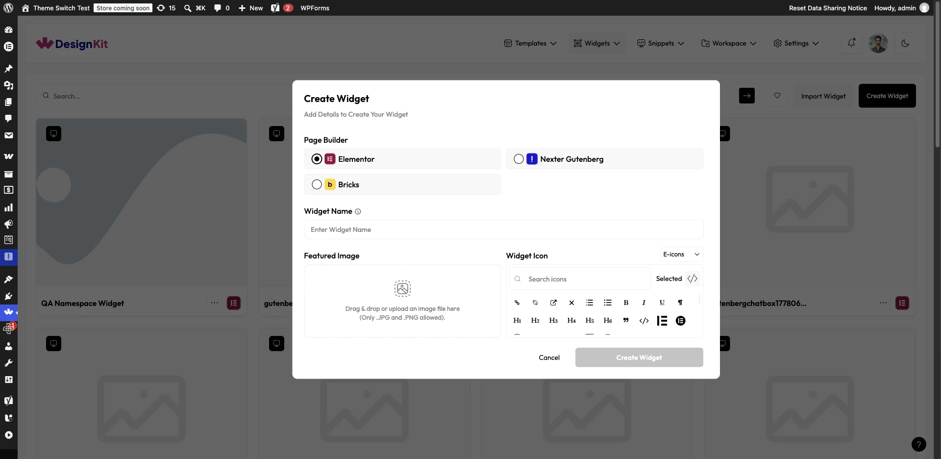
- Page Builder — choose Elementor, Nexter Gutenberg, or Bricks. (Live UI now reads “Nexter Gutenberg,” not plain “Gutenberg.”)
- Widget Name — add your widget name.
- Featured Image — optional, visible on the WDesignKit Widget Listing section.
- Widget Icon — from E-icons or Font Awesome libraries.
Once done, click Create Widget. On the next page, you’ll see the widget builder editor with three columns: the Code Editor Panel, the Layout Panel, and the Controller Panel.
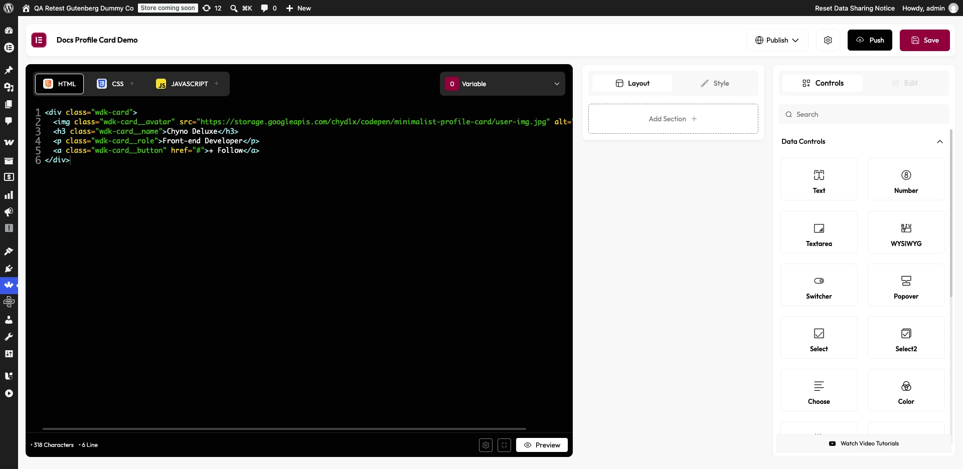
Add and Insert Controls
Once you have created your widget, click Save at the top. By clicking the Settings icon, you can edit widget information, change category, add search Keywords, and a Help Link.
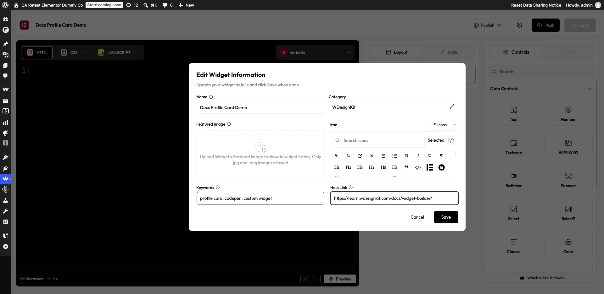
From the Push button, you can upload your widget to the public library so other WDesignKit users can access it. You can only push widgets you created yourself — duplicate first if you want to publish someone else’s widget.
Worked Example: Codepen to Widget
For example, we will convert this Codepen profile card layout into an Elementor widget.

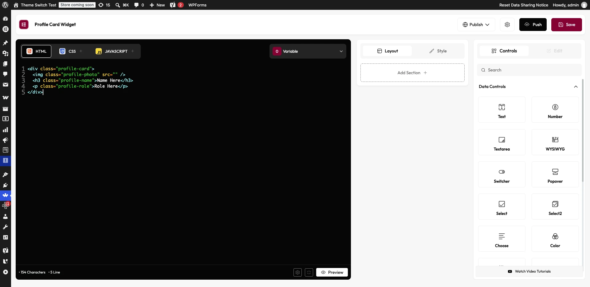
- Paste the HTML into the HTML tab (excluding
<!DOCTYPE>,<html>,<head>,<body>). - Paste the CSS into the CSS tab (excluding global selectors like
bodyor*). - Add any JS to the JS tab.
- Use Media control for the profile image, Text controls for title/subtitle/button text, and URL control for the button link.
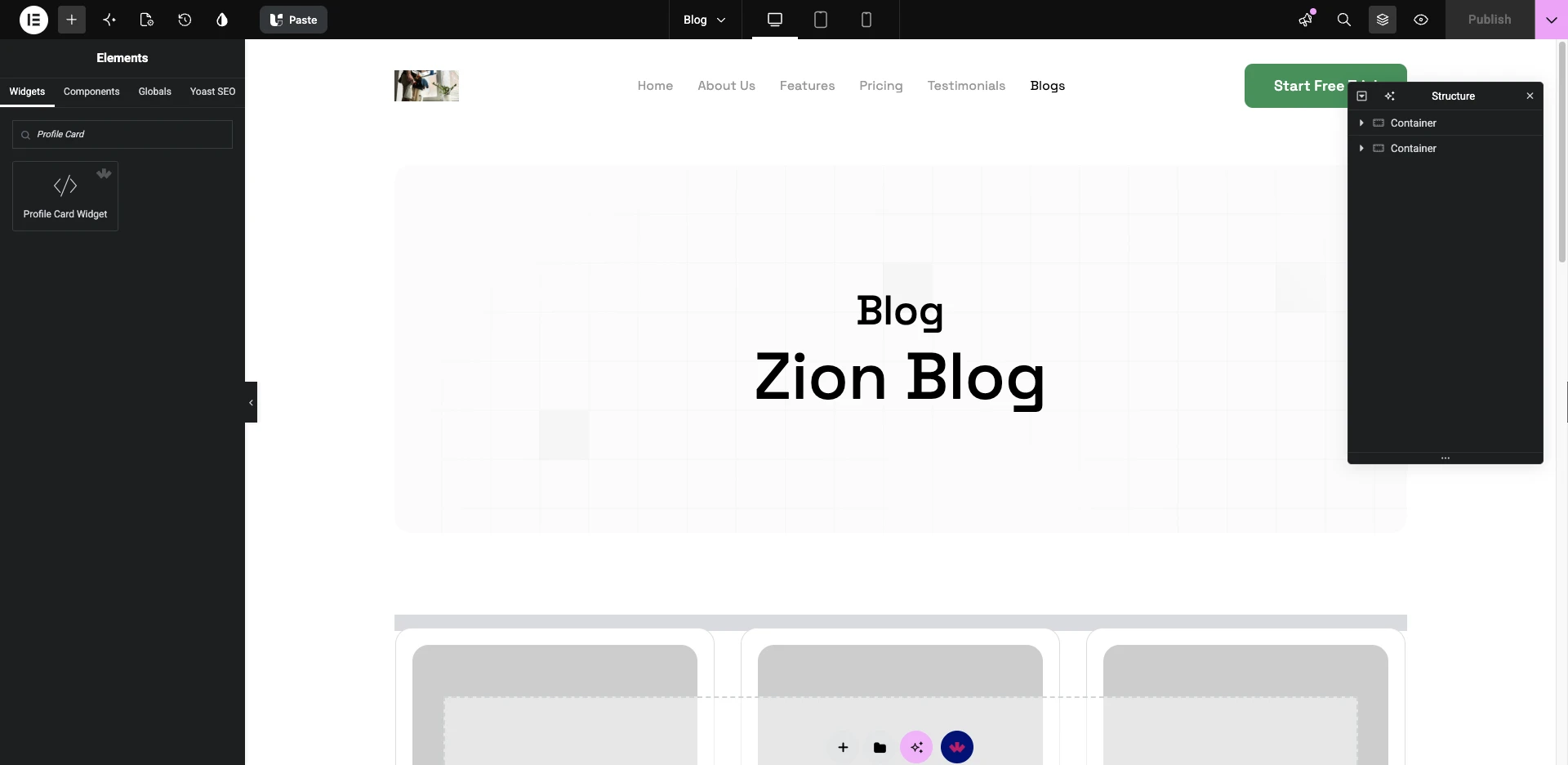
Note: To use a Bricks widget you need the Bricks theme installed and activated.
Use Cases
- Codepen to real widget — turn any HTML/CSS snippet into a draggable Elementor element.
- Client-specific components — build a one-off design element no marketplace widget covers.
- Reusable brand components — standardize a custom card/banner/CTA across projects.
- Cross-builder widgets — rebuild the same control logic for Bricks or Nexter Gutenberg.
Limitations
- Requires basic HTML/CSS comfort — the builder wires code into Elementor, it doesn’t generate layout code for you.
- Bricks widgets require the Bricks theme installed and activated, not just the builder plugin.
- Widget Icon libraries vary by page builder; Font Awesome 4/5 icons need their library manually loaded for Elementor.
- You can only push widgets you created yourself to the public library.
Troubleshooting
- Widget Builder errors out loading a custom post type — if a Dynamic control can’t find the expected post type, confirm the CPT is registered with the right visibility/REST support before assuming the control itself is broken.
- Adding post meta to a widget — post meta fields aren’t exposed by the standard Post Listing control by default; this needs a custom field control approach rather than Post Listing alone.
- WDesignKit appears to break the Elementor editor — if this happens after adding a custom widget, check for a plugin conflict by deactivating other Elementor addons one at a time before assuming the widget’s own code is at fault.