
Animated Timeline Widget for Elementor
On this page
What It Does
The Animated Timeline widget shows milestones and events in an easy-to-read animated timeline. It’s built for company history, project steps or personal achievements, with an icon, title, date and short description for each point.
See it working on a live page before adding it to your own site:
Why It Matters
Presenting a sequence of events as plain paragraphs makes the order hard to follow at a glance. A timeline format shows progression visually, which is easier to scan and remember than a wall of text, and this widget builds one that’s fully responsive by default.
What You Get
- A repeater-based timeline, 5 items by default and expandable
- Per-item image, title, description and an optional button
- Selectable icon type per item (Text, Icon, Image or Dot) and per pin marker
- Left/right card positioning and an optional top label per item
Benefits
- Turns a sequence of events into a scannable visual story with no custom layout work
- Per-item styling for normal and hover states gives fine visual control
- A scroll-triggered border fill effect adds motion without custom animation code
Capabilities
- Layout Style: a pre-defined display style chosen from a dropdown
- Timeline repeater: Select Image, Title, Description and an optional Button (text, icon/SVG) per item
- Side icon type: Text, Icon, Image or Dot, shown beside each card
- Pin icon type: Text, Icon or Image for the timeline marker itself
- Card position: Select Position sets each card to the left or right of the timeline
- Top Label: an optional label above each card, with its own style, icon and extra text field
- Extra Options: Icon Position (top/center/bottom), Content Arrow toggle, and Border Fill Effect toggle
- Style tab: further visual customization of the timeline
How It Works
Each repeater item becomes one point on the timeline, positioned left or right per its Select Position setting, with a pin marker and side icon rendered according to the icon type you choose for each. With Border Fill Effect enabled (which needs more than one repeater item to be visible), the timeline’s connecting line fills with color progressively as the visitor scrolls past each point.
How to Use It
Required Setup
- Elementor FREE Plugin installed & activated.
- You need to have the WDesignKit plugin installed and activated.
- Make sure you’ve created an account and logged into it.
- This is a pro widget. A valid WDesignKit Pro license is required to access and use them.
- Make sure you’ve downloaded the Animated Timeline widget.
How to Activate the Animated Timeline Widget
Go to
- WDesignKit → Widgets → Browse Widgets.
- Search the widget name and select Elementor as the Page Builder.
- Click on the Download icon.
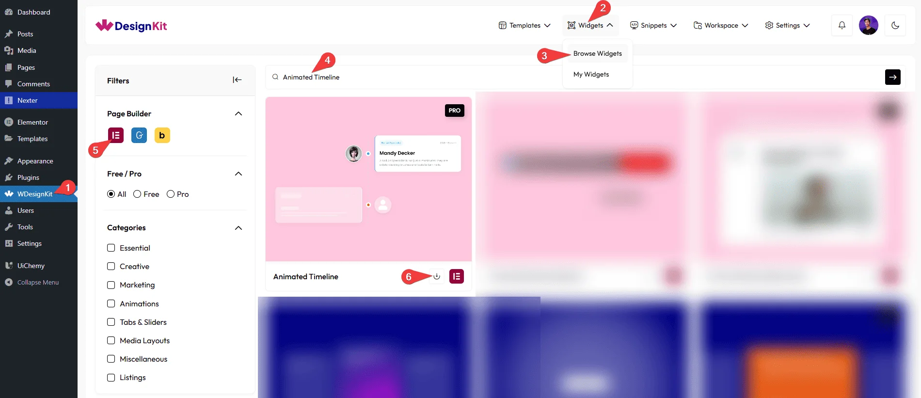
Using the Widget in Elementor
Add the Animated Timeline widget to the page.
Layout
You can select a pre-defined style from the Style dropdown.
Note : From this tab, based on the style you selected, you will see different options to add the content.
Content
From the Timeline section, you can add the list items. By default, you’ll find five repeater items; open one.
From the Select Image section, you can choose an image for the card.
In the Title field, you can add the title of the card.
In the Description field, you can add the description of the slide.
By enabling the Button toggle, you will be able to see its settings.
In the Button Text field, you can add a button text to the card.
From the Select Icon section, you can choose either an icon or an SVG for the button.
From the Select Type dropdown, you can select the icon type that will be added beside the card. Here you’ll find four options –
- Text – To show a text.
- Icon – To show an icon.
- Image – To show an image.
- Dot – To show a dot.
Based on your selection, you’ll find different options to add the content.
Then you’ll find styling options to customize the title color, description color, icon color, and SVG color for both normal and hover states, along with background color and border settings for each state as well.
From the Select Type dropdown, you can choose the icon type that will be added as a pin. You’ll find three options:
- Text – to display text
- Icon – to display an icon
- Image – to display an image
Based on your selection, you’ll find different options to add the content.
From the Select Position dropdown, you can choose the card’s left or right position.
By enabling the Top Label toggle, you will be able to see its settings.
From the Label Style dropdown, you can choose the label style.
In the Text field, you can add the text to the label.
From the Select Icon section, you can choose either an icon or an SVG for the label.
In the Extra Text field, you can add any extra text to the label.
Then you’ll find styling options to customize the text color, text background color, icon color, SVG color, and extra text color for both normal and hover states, along with background color and border settings for each state as well.
You can click on the + Add Item button to add more items.
Extra Options
You can place the icon top, center, or bottom of the card from the Icon Position dropdown.
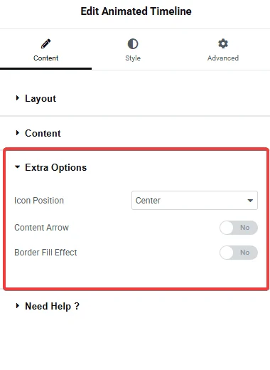
By enabling the Content Arrow toggle, you will see an icon side arrow of the card.
By enabling the Border Fill Effect toggle, you will see the color fill effect in the timeline. As you scroll, the fill effect will come.
Note: To see the border fill effect, you need to add more than one item using the repeater.
Then, from the Style tab, you can further customize the style of the Animated Timeline.
Use Cases
Use an animated timeline when you want to show things in order, step-by-step, or year-by-year.
Best For
- Company History: Show how your brand has grown over the years.
- Project Steps: Explain your workflow or process in simple steps.
- Event Schedule: Display event programs or conference timelines.
- Learning Path: Show course levels, modules, or student progress.
- Personal/Brand Story: Present any journey or storytelling visually.
- Roadmap: Show future plans, product updates, or upcoming releases.
Limitations
- This is a Pro widget: requires a valid WDesignKit Pro license and must be individually downloaded before use.
- The Border Fill Effect only shows with more than one repeater item; it does nothing on a single-item timeline.
- The widget carries a runtime dependency (registered as a
wdkit/wb-*block/widget) that must be present on any site the layout is copied to; pasting content between sites without WDesignKit active on the destination breaks the timeline.
Troubleshooting
No FluentSupport tickets specific to this widget were found at the time of writing; the items below are workflow-derived, not ticket-sourced.
- Border Fill Effect not showing: this effect requires more than one item in the Timeline repeater (see Limitations above).
- “Your site doesn’t include support for the ‘wdkit/wb-…’ block” error: this happens when content using this widget is copied to a site where WDesignKit (and the specific downloaded widget) isn’t installed/active. Install and activate WDesignKit and re-download the Animated Timeline widget on the destination site before pasting the content.