
Button Click Animation Element for Bricks
On this page
What It Does
The Button Click Animation element for Bricks adds a stunning particle effect, or a simple button-press animation, when a visitor clicks (or hovers over) the button.
See it working on a live page before adding it to your own site:
Why It Matters
A plain button click is easy to miss. A short particle burst or press animation gives the visitor clear, satisfying feedback that their click registered, which is useful for CTAs where you want the click to feel rewarding, not just functional.
What You Get
- A button with a configurable On Hover or On Click particle-animation trigger
- Button text, an optional icon, and a link URL
- A repeater-based Shapes list so you can combine multiple particle shapes and colors
- Responsive button alignment
Benefits
- A distinctive micro-interaction with no custom JavaScript or CSS animation to write
- Works as a drop-in replacement for a standard button in Bricks
- Multiple particle shapes and colors can be combined per button
Capabilities
- Select Trigger: On Hover or On Click, controls when the animation fires
- Button Text, an optional Button Icon toggle, and a Url field for the button’s link
- Button Alignment: set per responsive device
- Shapes repeater: each item has a Select Shape dropdown (pre-defined shapes or a custom SVG) and a Color field; add multiple shapes via + Add Item
- Style tab: further visual customization of the button itself
How It Works
When the trigger event you selected (hover or click) fires on the button, the element plays a short particle burst using every shape configured in the Shapes repeater, each rendered in its own configured color. With Button Icon enabled, the icon animates alongside the text; the link in the Url field behaves like a normal button link independent of the animation.
How to Use It
Required Setup
- Bricks Builder installed & activated.
- You need to have the WDesignKit plugin installed and activated.
- Make sure you’ve created an account and logged into it.
- Make sure you’ve downloaded the Button Click Animation element.
How to Activate the Button Click Animation Element
Go to
- WDesignKit → Widgets.
- Search the element name and select Bricks as the Page Builder.
- Click on the Download icon.
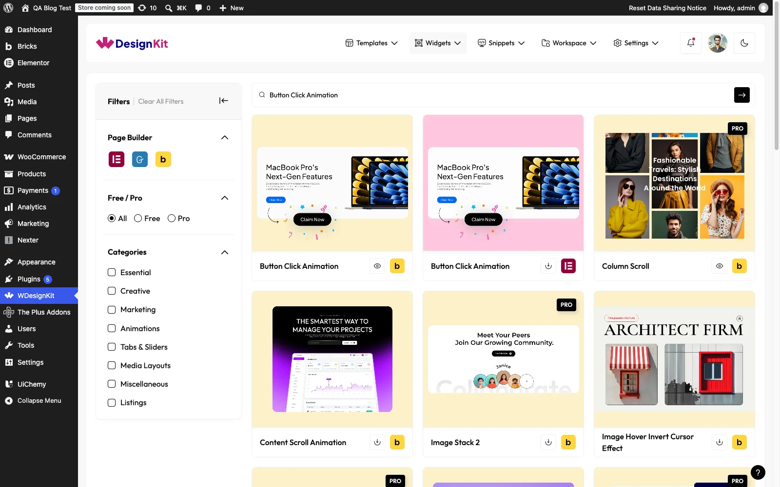
Using the Element in Bricks
Add the Button Click Animation element to the page.
From the Select Trigger dropdown, you have to select the trigger type. Here you’ll find two options –
- On Hover – To show the button animation on hover.
- On Click – To show the button animation on click.

In the Button Text field, you have to add the button text.
Then you can add an icon to the button by enabling the Button Icon toggle.
In the Url field, you can add different types of links to the button.
From the Button Alignment section, you can align the button for responsive devices.
Then from the Shapes section, you can add different shapes to create a particle effect on the button click. By default, you’ll find one repeater item, open it.
From the Select Shape dropdown, you can select a pre-defined shape or add a custom SVG.
Then from the Color section, you can change the color of the shape.
You click on the +ADD ITEM button to use multiple shapes together.
You can customize the button style further from the Style tab. Use the VIEW DEMO link above to see the live particle effect in action.
Use Cases
- Primary CTA buttons that should feel rewarding to click (signup, purchase, download)
- Playful or celebratory brand moments (confetti, sparkle or burst effects)
- Landing pages or promo sections that want a distinctive, memorable button interaction
Limitations
- This is a Bricks-only element; it is not available for Elementor or Gutenberg (a separate WDesignKit widget/block library serves those builders).
- The element carries a runtime dependency (registered as a
wdkit/wb-*block/widget) that must be present on any site the layout is copied to; pasting content between sites without WDesignKit active on the destination breaks the animation.
Troubleshooting
No FluentSupport tickets specific to this element were found at the time of writing; the items below are workflow-derived, not ticket-sourced.
- Animation not firing: confirm the Select Trigger setting matches the interaction you’re testing (a click won’t trigger an On Hover-only animation, and vice versa).
- Only one shape appears in the burst: add more items to the Shapes repeater via + Add Item; a single item produces a single-shape effect.
- “Your site doesn’t include support for the ‘wdkit/wb-…’ block” error: this happens when content using this element is copied to a site where WDesignKit (and the specific downloaded element) isn’t installed/active. Install and activate WDesignKit and re-download the Button Click Animation element on the destination site before pasting the content.