
Team Member Slider Widget for Elementor
On this page
What It Does
The Team Member Slider widget builds an interactive, sliding team section for Elementor. Each team member is a repeater item with a name, designation, link, and separate normal/hover images, so hovering over a card can swap in a second photo. The whole layout runs on one of three pre-built styles chosen from a single Style dropdown, so no manual grid building is required.
Why It Matters
A static grid of team photos needs manual columns, manual spacing, and separate mobile adjustments at every breakpoint. This widget handles all of that from one settings panel: desktop, tablet, and mobile each get their own column count and row count, the slide direction and duration are configurable, and the hover-image swap adds interactivity without custom CSS or JavaScript.
What You Get
- 3 layout styles selectable from one dropdown, each changing how the name, designation, and image are arranged.
- Per-item repeater fields: name, designation, link URL, a normal image, and a separate hover image.
- Independent column and row counts for desktop, tablet, and mobile — six separate responsive fields, not one shared setting.
- Animation controls: duration in seconds and a horizontal/vertical direction choice.
- Style-tab customization: typography and text color per name/designation, image width/height, card padding and gap, and slider/item gap and height.
- Tablet/mobile link toggles to turn the per-item link on or off on smaller devices independently of desktop.
Benefits
- Builds a responsive team section without writing custom CSS for breakpoints.
- Hover images add a second visual per team member at no extra setup cost.
- One Style dropdown covers three distinct visual layouts instead of building each from scratch.
Capabilities
Before you start, make sure you have:
- Elementor FREE Plugin installed & activated.
- The WDesignKit plugin installed and activated.
- A WDesignKit account created and logged into.
- This is a Pro widget. A valid WDesignKit Pro license is required to access and use it.
- The Team Member Slider widget downloaded from the WDesignKit widget library.
How It Works
Each slide is one item in the widget’s repeater field. Adding a name, designation, link, and image to a repeater item creates one team-member card; the widget lays those cards out according to the Style you picked and the column/row counts you set per device. The hover image field is optional — when it is set, hovering the card crossfades from the normal image to it.
How to Use It
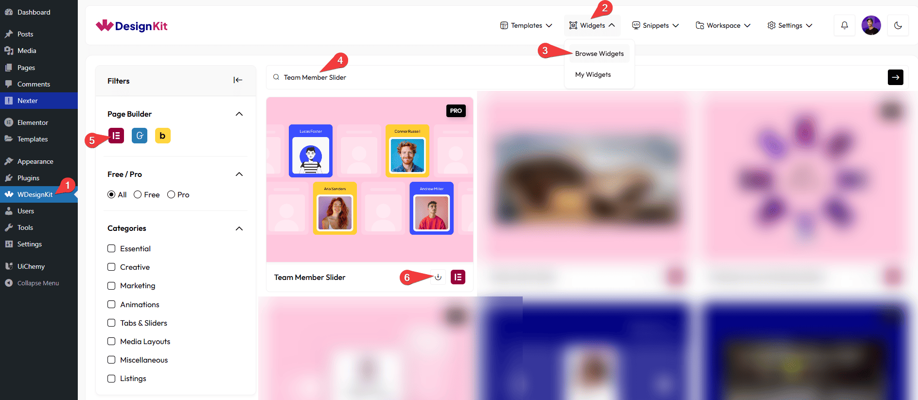
How to Activate the Team Member Slider Widget?
Go to
- WDesignKit → Widgets → Browse Widgets.
- Search the widget name and select Elementor as the Page Builder.
- Click on the Download icon.
How to Use the Team Member Slider Widget in Elementor?
Add the Team Member Slider widget to the page.
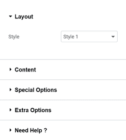
Layout
You can select a pre-defined style from the Style dropdown.
Note : From this tab, based on the style you selected, you will see different options to add the content.
Content
From the Slides section, you can add the image items. By default, you’ll find nine repeater items, open it.
In the Name field, you have to add the team member’s name.
In the Designation field, add the team member’s designation.
Note: The designation will be displayed only in Style 2.
From the URL field, you can add a link that opens when the item is clicked.
From the Select Image field of Normal, you can upload or select the image displayed by default.
From the Select Image field of Hover, you can upload or select the image shown on hover.
From the Background Type field, you can customize the background of the item.
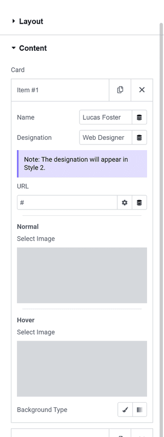
You can click on the + Add Item button to add more items.
Special Options
By enabling the Tablet Link toggle, you can activate the link for tablet devices.
By enabling the Mobile Link toggle, you can activate the link for mobile devices.
Extra Options
From the Desktop Row field, you can set how many items are displayed per row on desktop devices.
From the Tablet Row field, you can define the number of items shown per row on tablet screens.
From the Mobile Row field, you can choose how many items appear per row on mobile devices.
From the Duration field, you can control the animation speed by setting the duration in seconds.
Note: You have to set the duration value in seconds to control the animation speed.
From the Direction field, you can select the animation direction, either Horizontal or Vertical.
Then, from the Style tab, you can further customize the style of the Team Member Slider.
Use Cases
Use this widget when you want to present your team members in an interactive, visually appealing, and professional way.
Best For:
- Team Introductions: Showcase your team members with their name, designation, and image so users can easily get to know the people behind your brand.
- Company “About Us” Pages: Create a clean and engaging team section that highlights your company culture and professionalism.
- Agencies & Businesses: Perfect for digital agencies, startups, corporate websites, and service-based businesses to present their team clearly.
- Portfolio Websites: Display collaborators, designers, developers, or contributors in a structured and interactive slider format.
- Hover-Based Interactions: Use hover images to show alternate photos, social-style visuals, or creative effects for better engagement.
- Responsive Team Sections: Easily control how many team members appear on desktop, tablet, and mobile devices for a seamless experience.
- Landing Pages: Build trust by introducing key team members directly on landing pages without taking up too much space.
- User Engagement: The slider interaction encourages users to scroll through team members and explore profiles naturally.
- Clean & Professional Websites: Ideal for websites that want a modern, organized, and visually consistent way to display team information.
Limitations
- Elementor only — there is no Gutenberg or Bricks version of this widget in the WDesignKit library at this time.
- Requires a Pro license. The widget cannot be downloaded or used on a free WDesignKit account.
- The designation field only displays in Style 2 — it is stored for every style but only rendered in one of the three layouts.
Troubleshooting
Widget doesn’t appear in the Elementor panel after downloading. Confirm the download actually completed under WDesignKit → Widgets → My Widgets, then reload the Elementor editor. A Pro widget download that fails silently (expired or missing license) will not add it to the panel.
Hover image isn’t showing. Check that a Hover image is actually set on that repeater item — it is a separate field from the Normal image and is left empty by default.
Designation text isn’t visible. This is expected outside Style 2 — switch the Style dropdown in the Layout tab to see it.
Column/row counts don’t seem to apply. Desktop, tablet, and mobile each have their own Column and Row fields in Extra Options — check the field for the device width you are previewing, not just the desktop values.