
Tag Cloud Widget for Elementor
On this page
What It Does

The Tag Cloud widget displays the tags used in your posts in a simple, eye-catching cloud style in Elementor. You can also add your own custom tags to highlight specific topics instead of pulling from post tags.
See it working on a live page before adding it to your own site:
Why It Matters
A plain list of tags is easy to overlook. A tag cloud style makes popular topics visually scannable at a glance and gives visitors an interactive way to explore and navigate to content based on the tags used across your site, without needing a custom taxonomy archive page.
What You Get
- Three visual styles for the tag cloud, switchable from a single dropdown
- A choice between pulling tags automatically from Post taxonomy or building a custom Repeater list of your own tags
- Optional icon or image per tag
- Independent column counts for desktop, tablet and mobile
Benefits
- No custom taxonomy template or theme code required to display a tag cloud
- Works with real post tags or fully custom content, your choice
- Responsive column control keeps the cloud readable on any device
Capabilities
- Select Style: choose from three different display styles for the tag cloud
- Content Type: Post (pulls from an existing taxonomy) or Repeater (fully custom tags)
- Taxonomy and Post Type selection: when Content Type is Post, choose which taxonomy and post type to pull tags from, plus a Max Post limit
- Per-tag icon: None, an Icon/SVG, or an Image, plus Text and URL fields per repeater item
- Column control: Desktop, Tablet and Mobile column counts set independently
- Gap control: adjust spacing between columns for responsive devices
- Style tab: font size, text color, icon color, SVG color, background color and border type, controlled separately for Style 1/2 and Style 3
How It Works
When Content Type is set to Post, the widget queries the taxonomy and post type you select and renders each term as a tag in the cloud, up to the Max Post limit. When set to Repeater, it renders whatever tags you add manually, each with its own text, optional icon or image, and destination URL. Either way the result is laid out using the column and gap settings you configure for each breakpoint.
How to Use It
Required Setup
- Elementor FREE Plugin installed & activated.
- You need to have the WDesignKit plugin installed and activated.
- Make sure you’ve created an account and logged into it.
- Make sure you’ve downloaded the Tag Cloud widget.
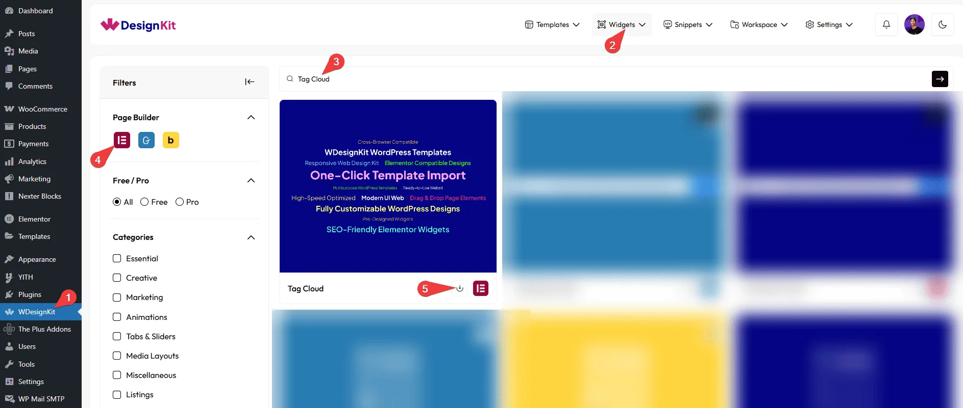
How to Activate the Tag Cloud Widget
Go to
- WDesignKit → Widgets.
- Search the widget name and select Elementor as the Page Builder.
- Click on the Download icon.
Using the Widget in Elementor
Add the Tag Cloud widget to the page.
Layout
From the Select Style dropdown, you can choose three different styles to display your post.
Content

From the Content Type dropdown, you have to select the content type. Based on the selected option, the corresponding content will be displayed. Here you’ll find two options –
- Post – Displays the post content that you have previously created.
- Repeater – Allows you to create and display custom content after selecting this option.
Based on your selection, you’ll find different options to add the content.
Let’s start with the Post section,
From the Taxonomy dropdown, you have to select the taxonomy.
Note: The Taxonomy option will work only when Post is selected as the content type.
From the Post Type dropdown, you have to select the post type.
In the Max Post field, you can set the maximum number of posts that will be displayed in the box.
Now, move on to the Repeater section.
By default, you’ll see one repeater item under the Items section. Open it.

From the Icon dropdown, you can select the icon type for the post tag. Here you’ll find three options –
- None – To only have a post tag.
- Icon – You can add an icon or SVG to the tag from the Icons Control section.
- Image – You can choose an image for the tag from the Media section.
Based on your selection, you’ll find different options to add the tag.
In the Text section, you can add the text as a tag.
Then, in the URL field, you can add the tag URL.
Then, you can manage the Desktop/Tablet/Mobile/ Font Size, Text Color, Icon Color, SVG Color, Background Color, and Border Type Options for Style 1 & Style 2.
For Style 3, you can set the font size for your tags separately for desktop, tablet, and mobile devices using the Desktop Font Size, Tablet Font Size, and Mobile Font Size sections, respectively.
Then, you can click the + Add Item button to add more tags.
Column
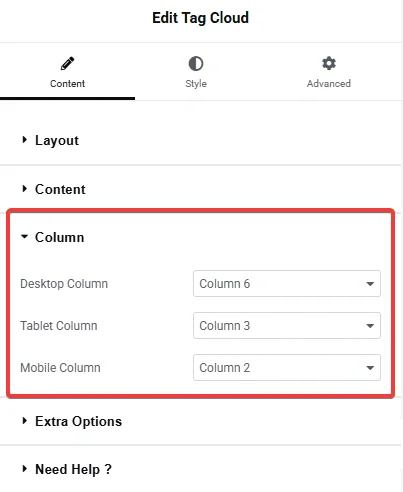
You can set the number of columns for your post type items separately for desktop, tablet, and mobile devices using the Desktop Column, Tablet Column, and Mobile Column sections, respectively.
Extra Options
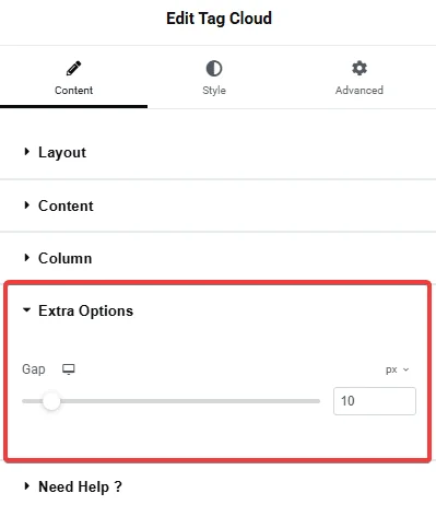
From the Gap section, you can adjust the gap between the columns for responsive devices.
Then, from the Style tab, you can further customize the style of the Tag Cloud.
Use Cases
- Blog sidebar or footer tag clouds pulled directly from post tags
- Category or topic navigation on a resources/blog landing page
- A fully custom set of clickable keyword links, unrelated to post tags, using the Repeater content type
Limitations
- The Post content type only pulls from one Taxonomy and Post Type at a time; mixing tags from multiple taxonomies in one cloud requires the Repeater content type instead.
- The widget carries a runtime dependency (registered as a
wdkit/wb-*block/widget) that must be present on any site the layout is copied to; pasting content between sites without WDesignKit active on the destination breaks the tag cloud.
Troubleshooting
No FluentSupport tickets specific to this widget were found at the time of writing; the items below are workflow-derived, not ticket-sourced.
- “No Result Found” shown instead of tags: this appears when Content Type is set to Post but the selected Taxonomy/Post Type combination has no terms assigned yet, or when Max Post is set too low. Confirm the taxonomy has tags applied to at least one post of the selected post type.
- “Your site doesn’t include support for the ‘wdkit/wb-…’ block” error: this happens when content using this widget is copied to a site where WDesignKit (and the specific downloaded widget) isn’t installed/active. Install and activate WDesignKit and re-download the Tag Cloud widget on the destination site before pasting the content.
- Tags not aligned as expected: alignment for Style 1/2 and Style 3 is controlled separately in the Style tab; confirm you are editing the style variant actually selected in the Layout section.