
Card Slider 3D Widget for Elementor
On this page
What It Does
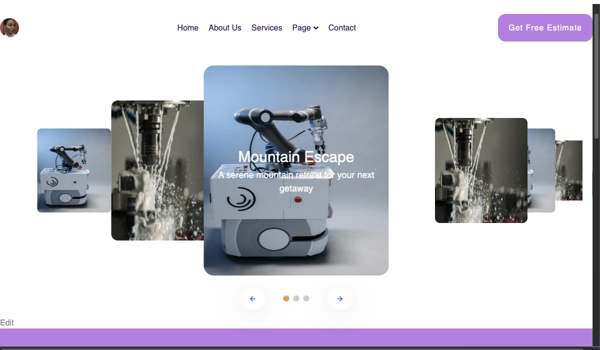
The Card Slider 3D widget lets you build an image and content slider with a 3D, perspective-based transition effect in Elementor.
See it working on a live page before adding it to your own site:
Why It Matters
A flat image grid or a standard 2D slider can feel dated for portfolio, product, or team-showcase sections. The Card Slider 3D widget adds a perspective/depth effect to a slider without needing custom CSS transforms or a third-party JS slider library.
What You Get
- A repeater-based 3D card slider you can drop into any Elementor page or section
- Per-slide Title, Description, URL and image fields, no limit on the number of slides beyond what the page can reasonably hold
- Built-in arrow and dot navigation toggles, each independently switchable
- Full Style-tab control over the slider’s look without writing CSS
Benefits
- A visually distinctive 3D slider effect with no custom code
- Repeater-based card content, add as many slides as you need
- Arrow and dot navigation options, plus full Style-tab customization
Capabilities
- Content repeater: each slide item has its own Title, Description, URL and Select Image fields, added via the + Add Item button
- Arrows toggle: independently switch a Left and a Right navigation arrow on or off
- Dots toggle: adds dot navigation under the slider
- Style tab: further customization of the card, arrow and dot appearance beyond the Content tab defaults
How It Works
Each slide is rendered as a card and the widget applies a CSS 3D perspective transform as it transitions between slides, so the active card appears to rotate forward while the adjacent cards recede, instead of a flat slide or fade. This is handled entirely by the widget; no custom CSS or JavaScript is required from the page builder.
How to Use It
Required Setup
- Elementor FREE Plugin installed & activated.
- You need to have the WDesignKit plugin installed and activated.
- Make sure you’ve created an account and logged into it.
- This is a pro widget. A valid WDesignKit Pro license is required to access and use them.
- Make sure you’ve downloaded the Card Slider 3D widget.
How to Activate the Card Slider 3D Widget
Go to
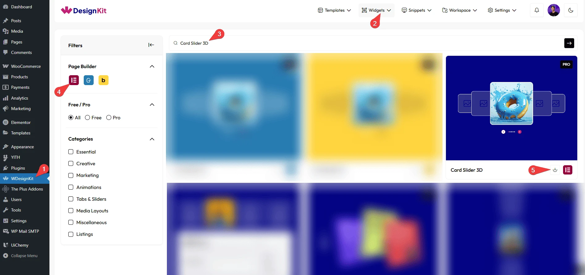
- WDesignKit → Widgets.
- Search the widget name and select Elementor as the Page Builder.
- Click on the Download icon.
Using the Widget in Elementor
Add the Card Slider 3D widget to the page.
Content
From the Add Card section, you have to add the image slides. By default, you’ll find one repeater item; open it.
From the Title field, you can add a title.
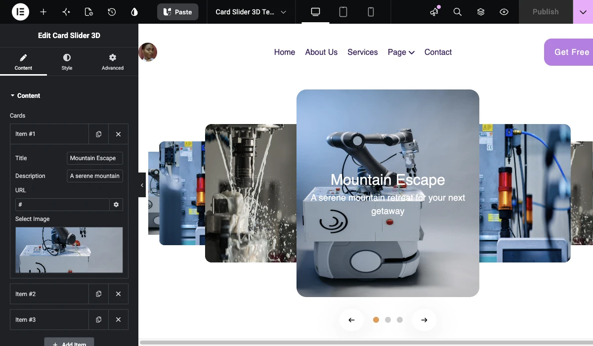
Then you can add a description from the Description field.
Then, in the URL field, you can add the card URL.
In the Select Image section, you have to add the slide image.
You can click on the + Add Item button to add more slides.
Arrows
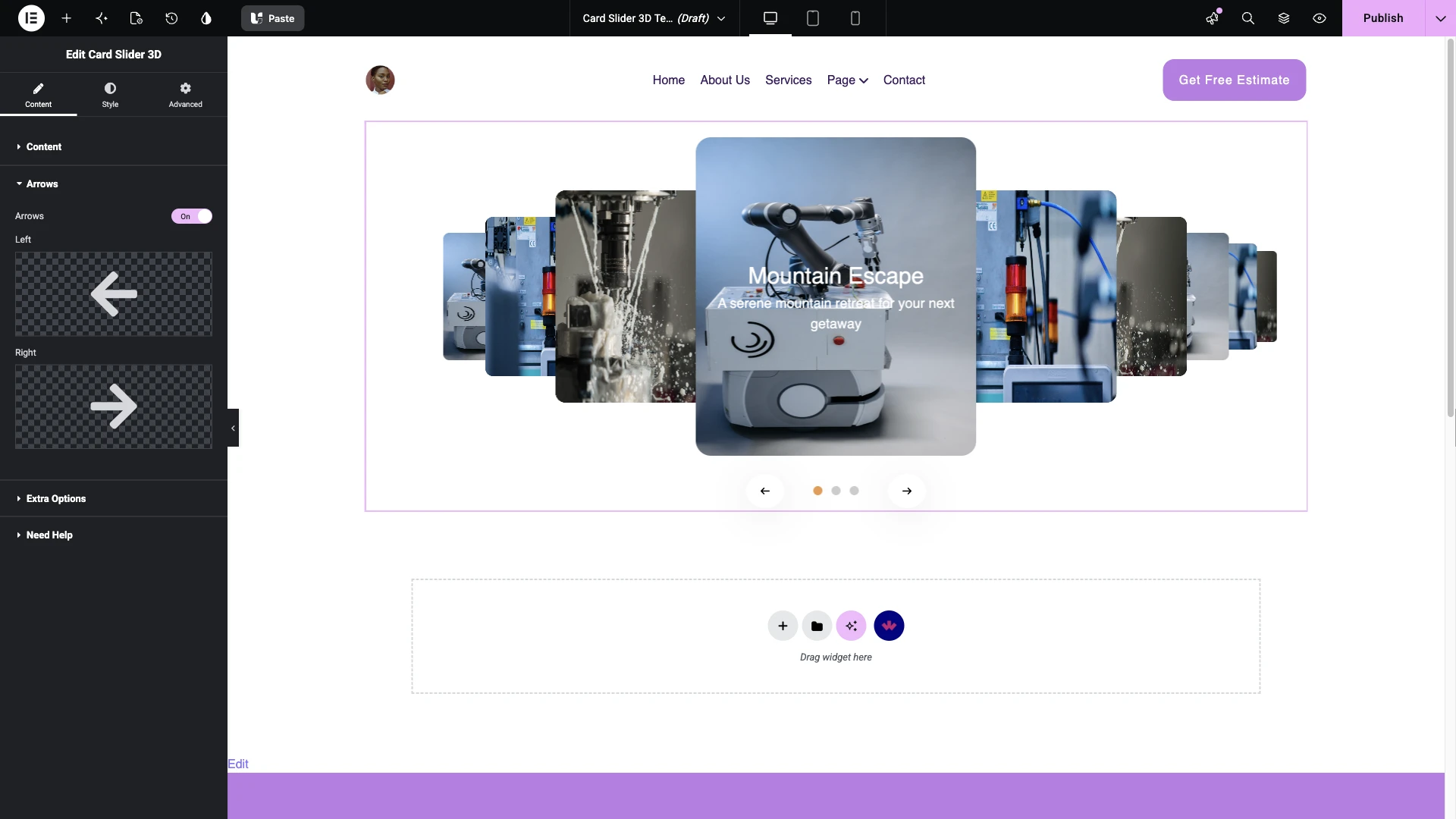
Enabling the Arrows toggle allows you to display navigation arrows on the slider. Here you’ll find two options –
- Left – To add a left navigation arrow to the slider.
- Right – To add a right navigation arrow to the slider.
Extra Options
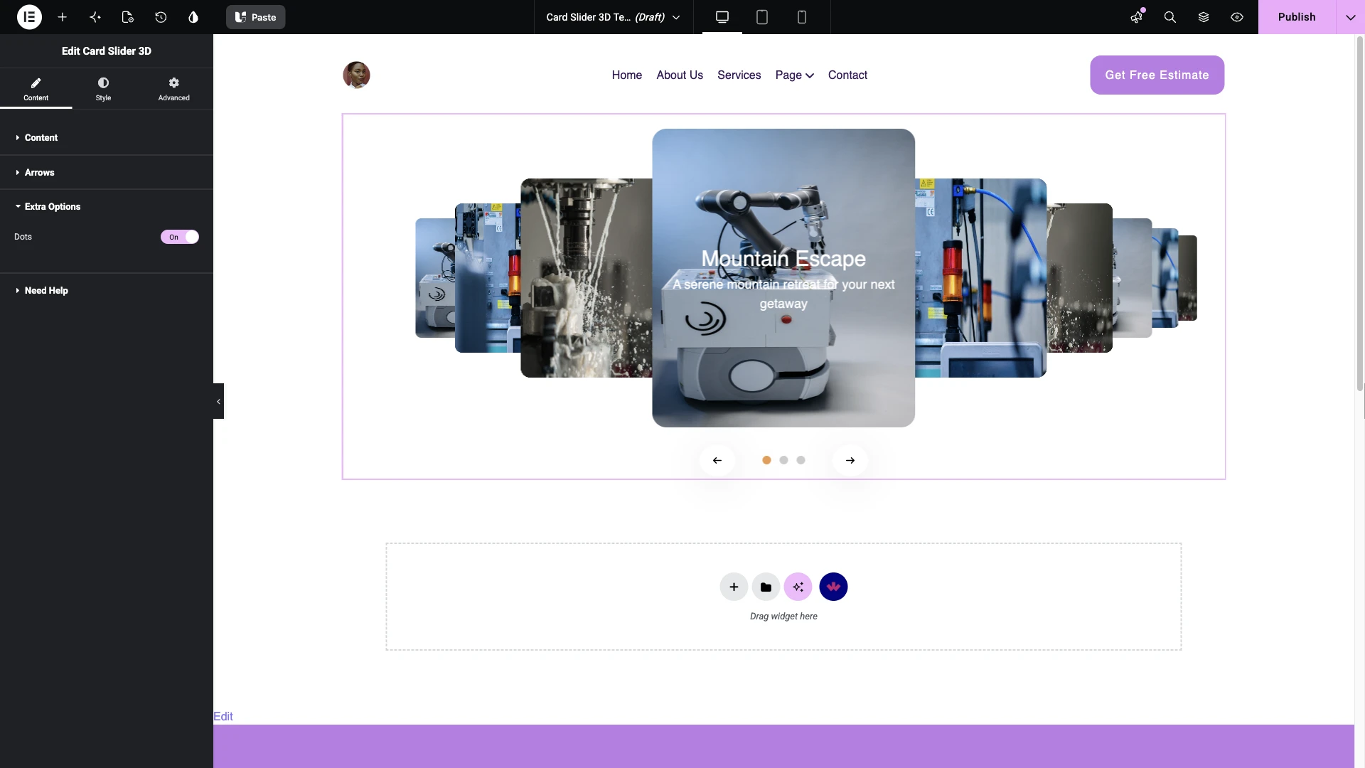
By enabling the Dots toggle, you can add the dot navigation to the slider.
From the Style tab, you can customize the style further.
Use Cases
- Portfolio or project showcases with a distinctive 3D card effect
- Team member or testimonial carousels
- Featured product or service highlights on a landing page
Limitations
- This is a Pro widget: requires a valid WDesignKit Pro license and must be individually downloaded before use.
- Per FluentSupport ticket #20539, there is no built-in per-card link/URL/button field; individual cards are not natively clickable. This is a feature gap, not a bug.
- The widget carries a runtime dependency (registered as a
wdkit/wb-*block/widget) that must be present on any site the layout is copied to; pasting content between sites without WDesignKit active on the destination breaks the slider.
Troubleshooting
- “Your site doesn’t include support for the ‘wdkit/wb-…’ block” error: per FluentSupport ticket #19238, this happens when content using this widget is copied to a site where WDesignKit (and the specific downloaded widget) isn’t installed/active. Install and activate WDesignKit and re-download the Card Slider 3D widget on the destination site before pasting the content.
- Need a clickable card / “Learn More” link: not currently a built-in option (see Limitations above); as of this writing there is no supported custom-code path from WDesignKit for this, so track the feature request rather than assuming a hidden setting exists.
- Slider looks fine in editor but breaks on the frontend: confirm Elementor and WDesignKit are both active and up to date on the live site, not just in the environment where the page was built.