
Card Hover Interactions Widget for Elementor
On this page
The Card Hover Interactions widget builds an info card with a title, description, and button styled with a customizable background and height.
1. What It Does
Displays a card with a title, description, and button over a customizable background, at a height you control.
2. Why It Matters
A dedicated info card widget keeps title, description, and a call-to-action button consistent across a features or services grid without rebuilding the layout from separate elements each time.
3. What You Get
A Title, Description, and Button with its own link, plus Style tab controls for the card’s background and height.
4. Benefits
Skipped, already covered above: the value is the consistent, styleable info card described in Why It Matters and What You Get, restating it here would not add anything new.
5. Capabilities
- Title field for the card heading
- Description field for the body text
- Button field for the button text, with a Url field for its link
- Style tab controls for the card’s background and height
6. How It Works
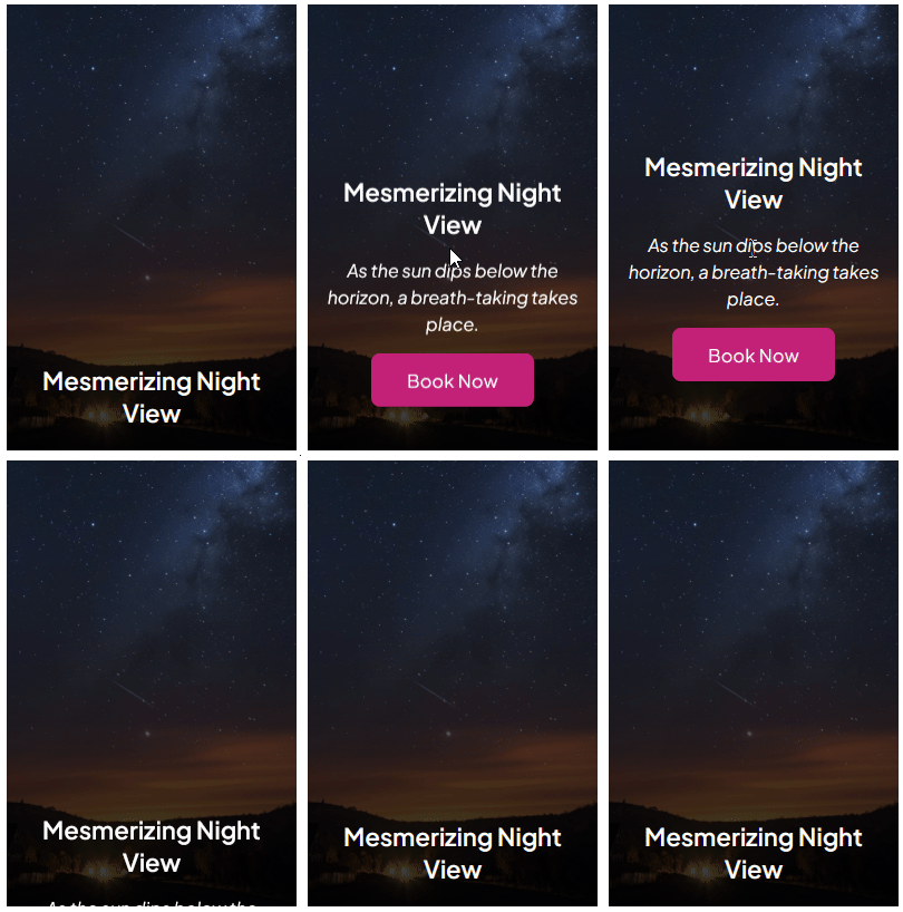
The Title, Description, and Button render as a single card, and the Style tab’s background and height controls shape the card’s overall look so a set of these widgets can be styled consistently across a grid.
7. How to Use It
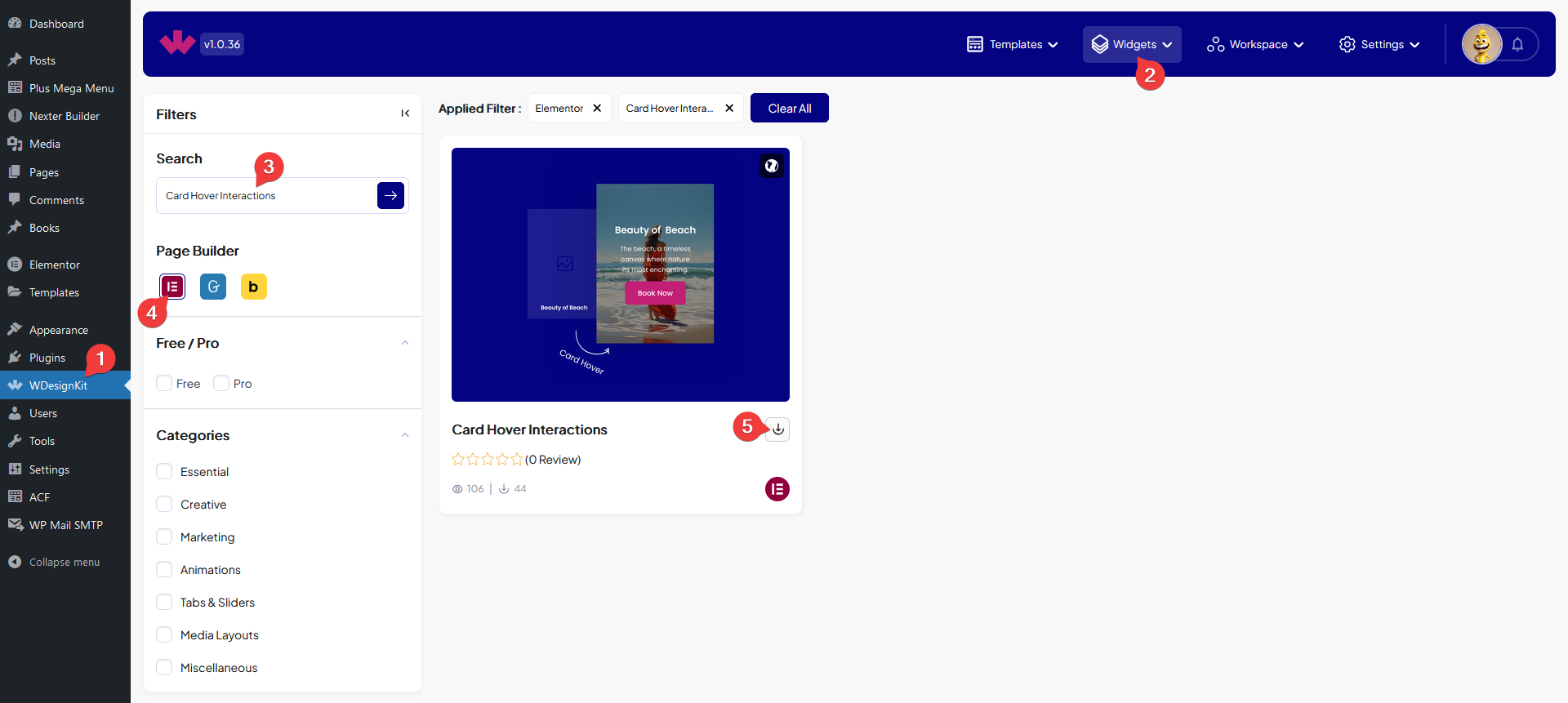
- Activate the Card Hover Interactions widget from WDesignKit’s Ready Widgets.
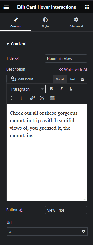
- Drag the widget onto the page and set the Title.
- Add a Description, set the Button text and Url, then set the card’s background and height on the Style tab.
8. Use Cases
- A repeated feature or service card in a grid, one widget instance per card
- A pricing or plan card with a title, short pitch, and a single call-to-action button
9. Limitations
- The widget holds one card per instance, a grid of cards needs one widget per card rather than a built-in repeater.
- There is no image field, the card is text and button only.
10. Troubleshooting
- Card height looks inconsistent across a grid: set the same Height value on the Style tab for each instance.
- Button link does not work: confirm the Url field has a complete address including https://.
- Background does not appear: check a background is actually set on the Style tab, it is transparent by default.