
Toggle Menu Widget for Elementor
On this page
This widget builds a toggle-triggered off-canvas style menu, a clickable button that opens a panel containing a navigation list, social links, and an extra call-to-action button.
1. What It Does
Toggle Menu gives you a trigger button and a Popup panel with its own Navigation links, Social links, an Extra Button, and a Close Button, confirmed live via the widget’s JSON config.
2. Why It Matters
It gives full design control over an off-canvas style menu, including social links and a CTA button inside the same panel, without relying on a theme’s built-in hamburger menu markup.
3. What You Get
A trigger Button (text and icon) plus a Popup panel with a Navigation link list, a Social link list, an Extra Button, and its own Close Button.
4. Benefits
Skipped, already covered above: the value is the design control described in Why It Matters, restating it here would not add anything new.
5. Capabilities
- Trigger Button with its own text and icon
- Popup panel with a Navigation section (labels and links)
- Social links section with its own icons and links
- Extra Button section for a standalone CTA inside the panel
- Dedicated Close Button for dismissing the panel
6. How It Works
Clicking the trigger Button opens the Popup panel, built from the Navigation, Social and Extra Button sections configured in the widget, closing via the panel’s own Close Button. Confirmed live via the widget’s JSON config, this is a structured panel with dedicated fields for each part, not a freeform content area.
7. How to Use It
- Activate the Toggle Menu widget from WDesignKit’s Ready Widgets.
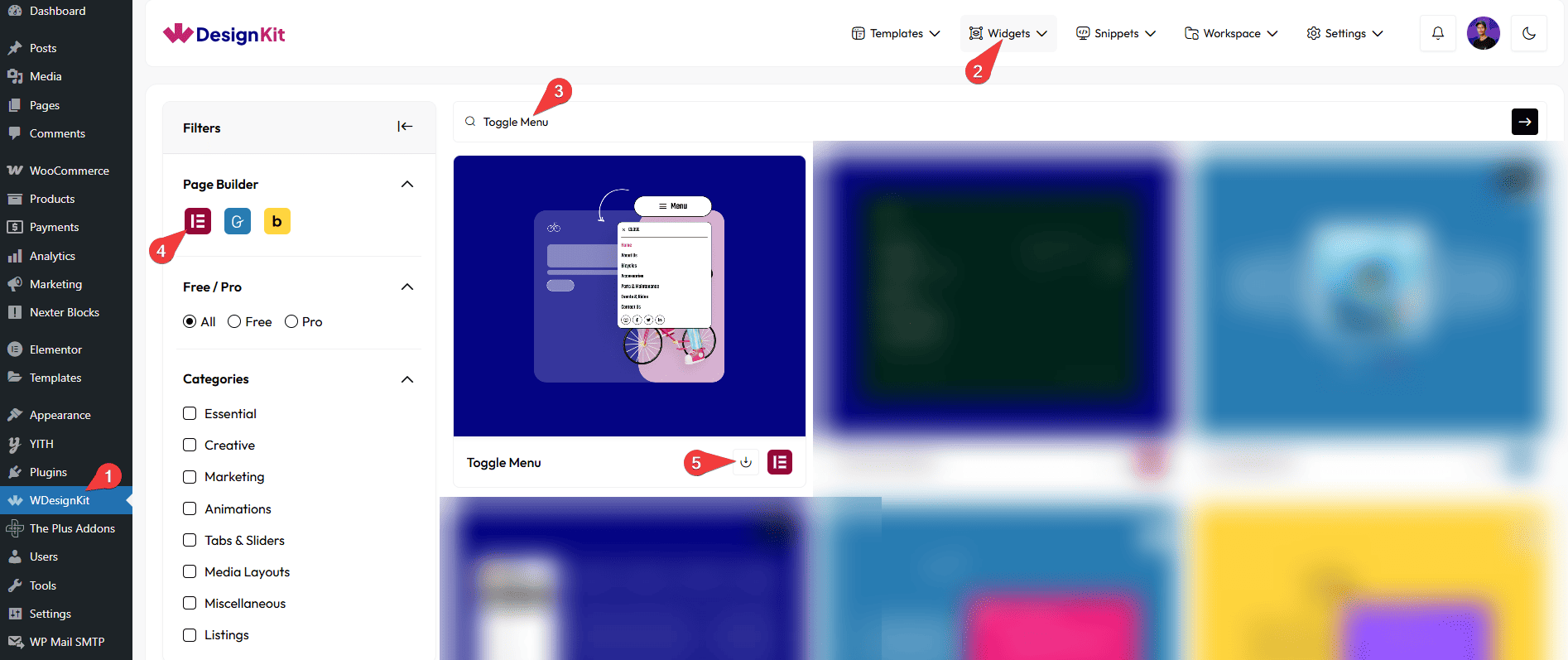
- Drag the widget onto the page, set the trigger Button’s text and icon, then fill in the Popup panel’s Navigation links, Social links, and Extra Button.
- Style the trigger, panel and Close Button under the Style tab.
- Preview the open and close behaviour on the published page.
8. Use Cases
- An off-canvas style menu combining navigation links and social icons in one panel.
- A secondary menu with a built-in CTA button, separate from the main navigation.
9. Limitations
- The panel’s Navigation section is its own structured field set, it does not pull items from an existing WordPress Menu under Appearance › Menus, so links must be added manually inside the widget.
- FLAGGED FOR OPERATOR: this widget shipped a “renamed content and style control labels” update since this screenshot was uploaded (screenshot dated 2024, control-label rename shipped as part of version 1.0.1), and this doc only has 1 screenshot (the activation step) with none showing the actual Popup/Navigation/Social/Extra Button configuration. A new screenshot set is recommended.
10. Troubleshooting
- Toggle click does nothing: confirm the widget is activated in Ready Widgets.
- Panel opens but shows no navigation or social links: these must be added inside the widget’s own Navigation and Social sections, they are not pulled from a WordPress Menu automatically.
- Close Button does not dismiss the panel: check that the Close Button style settings have not hidden it or placed it outside the visible panel area.