
Mini Hamburger Menu Widget for Elementor
On this page
What It Does
The Mini Hamburger Menu widget adds a compact, toggle-based navigation menu to your Elementor page: a hamburger icon that opens a menu panel with links, an optional call-to-action button, and optional social icons.
See it working on a live page before adding it to your own site:
Why It Matters
A compact, toggle-based menu keeps a layout clean while still giving visitors quick access to navigation links, a call-to-action button and social profiles, without needing a full header/mega-menu build.
What You Get
- A hamburger icon with selectable menu and icon animation styles
- A repeater-based menu items list, 5 items by default and expandable
- An optional call-to-action button with its own icon
- An optional social icons row, toggled on independently
Benefits
- Saves horizontal space compared to a full inline menu, useful on mobile and minimal layouts
- Combines navigation, a CTA button and social links in one compact component
- Style and icon animation are chosen from dropdowns, no custom CSS needed
Capabilities
- Menu Style: a pre-defined layout style for the menu panel, chosen from a dropdown
- Icon Style: a pre-defined animation style for the hamburger icon itself
- Menubar text: separate Open Menu and Close Menu button text fields (both must be filled for the text to show)
- Menu items repeater: Text and URL per item, unlimited via + Add Item
- Button: Text, URL and an icon/SVG selector for an optional CTA button inside the menu
- Social Icons: a toggle that reveals a repeater of icon + URL items, 3 by default
- Style tab: further visual customization of the menu, icon, button and social icons
How It Works
Clicking the hamburger icon toggles a menu panel open, animated according to the selected Icon Style. The panel lists whatever items you configure in the Menu Items repeater, plus the optional CTA button and social icons row if enabled. Clicking the icon again (or the Close Menu text, if set) closes the panel using the reverse of the same animation.
How to Use It
Required Setup
- Elementor FREE Plugin installed & activated.
- You need to have the WDesignKit plugin installed and activated.
- Make sure you’ve created an account and logged into it.
- Make sure you’ve downloaded the Mini Hamburger Menu widget.
How to Activate the Mini Hamburger Menu Widget
Go to
- WDesignKit →Widgets → Browse Widgets.
- Search the widget name and select Elementor as the Page Builder.
- Click on the Download icon.
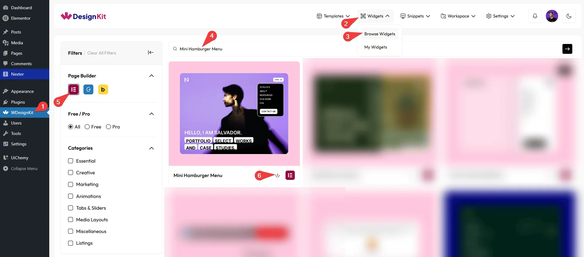
Using the Widget in Elementor
Add the Mini Hamburger Menu widget to the page.
Layout
You can select a pre-defined menu style from the Style dropdown.
Note: From this tab, based on the style you selected, you will see different options to add the content.
You can choose a pre-defined animation style from the Style dropdown under the Icon heading.
Note: Based on the icon style you select, you will see different icons and related options.
Menubar
Under the Open Menu heading, in the Text field, you can add the text that appears on the button to open the menu.
Under the Close Menu heading, in the Text field, you can add the text that appears on the button to close the menu.
Note: Button text will work only when both the Open Menu and Close Menu texts are added.
Content
From the Menu Items section, you can add the menu items. By default, you’ll find five repeater items; open them.
In the Text field, you can add the menu item text.
From the URL field, you can add a link that opens when the menu item is clicked.
You can click on the + Add Item button to add more items.
Button
In the Text field, you can add the text that will appear on the button.
From the URL field, you can add a link that opens when the button is clicked.
From the Select Icon option, you can choose an icon or SVG Icon to display on the button.
Social Icons
By enabling the Social Icons toggle, you will see the Items section for your menu.
From the Items section, you can add the social icon items. By default, you’ll find three repeater items; open them.
From the Select Icon field, you can choose the social media icon you want to display.
From the URL field, you can add the link that opens when the social icon is clicked (for example, a social media profile link).
You can click on the + Add Item button to add more items.
Then, from the Style tab, you can further customize the style of the Mini Hamburger Menu.
Use Cases
Use this widget when you want to add a compact, toggle-based navigation menu that keeps your layout clean while giving users quick access to important links and actions.
Best For
- Mobile & Responsive Websites: Ideal for small screens where a hamburger menu helps save space and improves navigation on mobile and tablet devices.
- Minimal Website Layouts: Keep the page design uncluttered by hiding navigation and actions inside a compact menu.
- Landing Pages: Add simple navigation or key call-to-action buttons without distracting users from the main content.
- Portfolio Websites: Display menu links, social icons, and buttons in a clean and modern hamburger-style menu.
- Business & Corporate Websites: Include navigation links, contact buttons, and social profiles in a structured and easy-to-access menu.
- E-commerce Websites: Provide quick access to categories, account links, or promotional buttons using a compact menu.
- Social Media Access: Show social media icons inside the menu to guide users to your social profiles.
- Call-to-Action Driven Pages: Add buttons such as “Contact Us,” “Get a Quote,” or “Buy Now” inside the menu to drive user actions.
- Modern UI Designs: Perfect for websites aiming for a sleek, modern, and user-friendly navigation experience.
Limitations
- Open Menu and Close Menu button text only display when both fields are filled in; leaving either one empty means neither shows.
- The widget carries a runtime dependency (registered as a
wdkit/wb-*block/widget) that must be present on any site the layout is copied to; pasting content between sites without WDesignKit active on the destination breaks the menu.
Troubleshooting
- Open/close animation not showing: per FluentSupport ticket #17603, if the panel opens or closes without the expected transition, re-check the Icon Style selection in the Layout section and confirm the site’s active theme or another plugin isn’t overriding the transition CSS.
- Open/Close Menu button text not appearing: this text only renders when both the Open Menu and Close Menu Text fields under Menubar are filled in (see Limitations above).
- “Your site doesn’t include support for the ‘wdkit/wb-…’ block” error: this happens when content using this widget is copied to a site where WDesignKit (and the specific downloaded widget) isn’t installed/active. Install and activate WDesignKit and re-download the Mini Hamburger Menu widget on the destination site before pasting the content.