
Horizontal Parallax Slider Widget for Elementor
On this page
The Horizontal Parallax Slider widget builds a horizontal content slider with a parallax effect on its slide thumbnails.
1. What It Does
Displays a row of image slides with a title and description each, laid out with a horizontal parallax motion as the visitor moves through them.
2. Why It Matters
A parallax slider gives an image gallery or feature list more depth than a static grid, useful for a visually driven section like a portfolio or gallery highlight.
3. What You Get
A Slides repeater with image, title, and description per item, per-device slide-per-view and spacing controls, and a sidebar position choice.
4. Benefits
Skipped, already covered above: the value is the horizontal parallax layout described in Why It Matters and What You Get, restating it here would not add anything new.
5. Capabilities
- Slides repeater, each item with Select Image, Title, and Description
- Slide Per View tab to set how many thumbnails show on desktop, tablet, and mobile
- Slide Space Between tab to set spacing between thumbnails per device
- Side Bar Position dropdown under Extra Option, left or right of the main slider
6. How It Works
Each Slides item renders as a thumbnail with its Title and Description, laid out with a parallax offset as the slider moves. Slide Per View and Slide Space Between control the thumbnail row’s density per device, and Side Bar Position sets which side the content sidebar sits on relative to the slider.
7. How to Use It
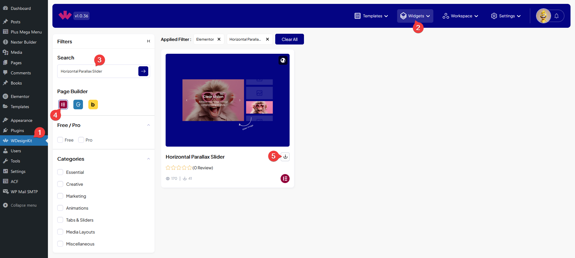
- Activate the Horizontal Parallax Slider widget from WDesignKit’s Ready Widgets.
- Drag the widget onto the page and add items under Slides, each with an image, title, and description.
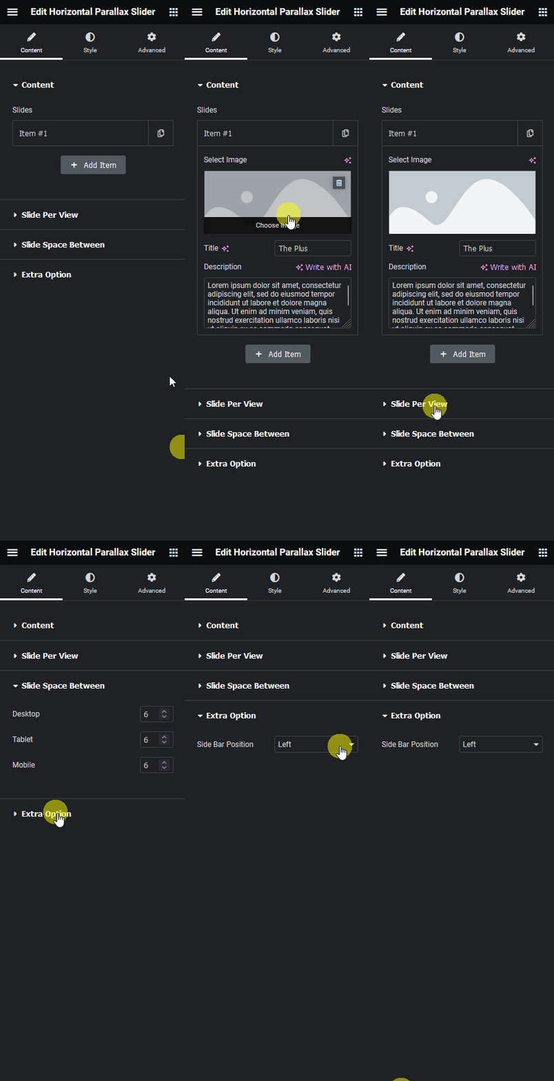
- Set Slide Per View and Slide Space Between for each device, then choose Side Bar Position under Extra Option.

8. Use Cases
- A portfolio or gallery section with a parallax browsing feel
- A feature highlight slider with a title and description per feature
9. Limitations
- Slide Per View and Slide Space Between apply to the whole slider per device, individual slides cannot override the spacing.
- Side Bar Position offers only left or right, there is no option to remove the sidebar layout entirely.
10. Troubleshooting
- Slides look cramped on mobile: lower the mobile Slide Per View or increase Slide Space Between for that device.
- Content sidebar appears on the wrong side: check Side Bar Position under Extra Option.
- New slide does not appear: confirm Select Image was actually set for that item, an empty image can leave the slide blank.