
Image Accordion Widget for Elementor
On this page
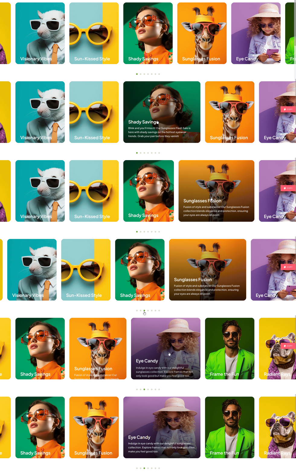
The Image Accordion widget displays a row of images that expand to reveal a title and description as the visitor hovers over each one.
1. What It Does
Displays a row of narrow image panels that each widen to show a title and description when hovered, then collapse back when the visitor moves to a different panel.
2. Why It Matters
An image accordion packs several image-and-text options into a compact row, letting visitors preview each one without a page reload or a full gallery grid.
3. What You Get
An Items repeater with title, description, and image per item, with color controls for normal and hover states plus a background and border option for the text area.
4. Benefits
Skipped, already covered above: the value is the compact hover-to-expand layout described in Why It Matters and What You Get, restating it here would not add anything new.
5. Capabilities
- Items repeater, each with Title, Description, and a Choose Image field
- Title and description color controls for normal and hover states
- Bottom Background section for the background and border behind the title and description
6. How It Works
Each Items entry renders as a narrow panel showing only its image, and hovering widens that panel to reveal its Title and Description over the Bottom Background styling, while the other panels stay narrow.
7. How to Use It
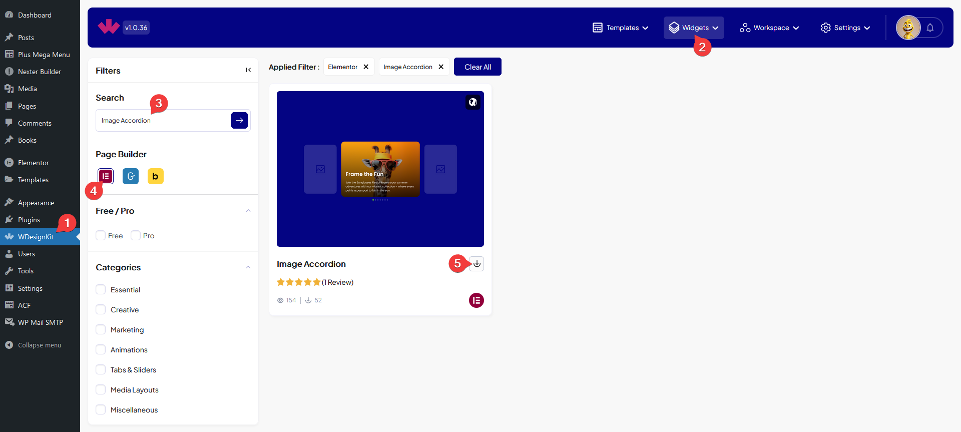
- Activate the Image Accordion widget from WDesignKit’s Ready Widgets.
- Drag the widget onto the page and add items under Items, each with a Title, Description, and Choose Image.
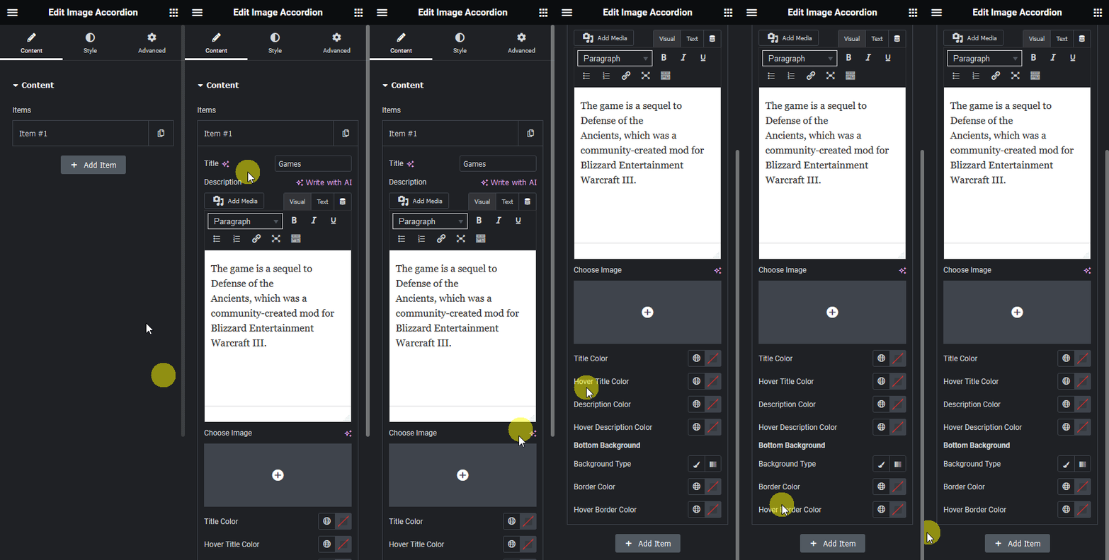
- Set the normal and hover text colors, plus the Bottom Background style, then customize further on the Style tab.
8. Use Cases
- A services or team row where each panel reveals a name or title on hover
- A compact category picker with an image-first, text-on-hover layout
9. Limitations
- The expand effect is hover-triggered, on touch devices only tapping reveals a panel’s text.
- All Items share the same Bottom Background styling, individual items cannot use a different background.
10. Troubleshooting
- Panel does not widen on hover: confirm Choose Image is set for that item, an empty image can prevent the panel from rendering correctly.
- Text is unreadable over the image: adjust the Bottom Background color and the title and description colors for better contrast.
- New item does not appear: confirm it was added via + Add Item and not left collapsed with empty fields.