
Horizontal Level Widget for Elementor
On this page
The Horizontal Level widget builds a horizontal step progress bar with manually controlled active states, icons, and descriptions for each step.
1. What It Does
Displays a horizontal line of numbered steps, each with a circle marker and its own text, icon, or image content, where you manually mark which steps are active.
2. Why It Matters
A horizontal layout suits a wide section, such as an order-status bar or a short process shown left to right, where a vertical timeline would not fit the design.
3. What You Get
A Style choice for the circle marker, Dot, Number, or Check Mark, a Levels repeater with text, icon, or image content per item, and a column-count setting per device.
4. Benefits
Skipped, already covered above: the value is the manually controlled horizontal timeline described in Why It Matters and What You Get, restating it here would not add anything new.
5. Capabilities
- Style dropdown for the circle marker: Dot, Number, or Check Mark
- Levels repeater, each item with a Select dropdown for Text, Icon, or Image content above the circle
- Description field per item
- Active toggle per item, fills the line and, with Check Mark style, shows the checkmark
- Extra Options tab to set the number of columns separately for desktop, tablet, and mobile
6. How It Works
Each Levels item renders as a circle on the horizontal line with its content above it. Enabling Active on an item fills that segment of the line, and with Style set to Check Mark, also swaps the circle’s marker to a checkmark. The Extra Options column count reflows how many steps sit per row at each breakpoint.
7. How to Use It
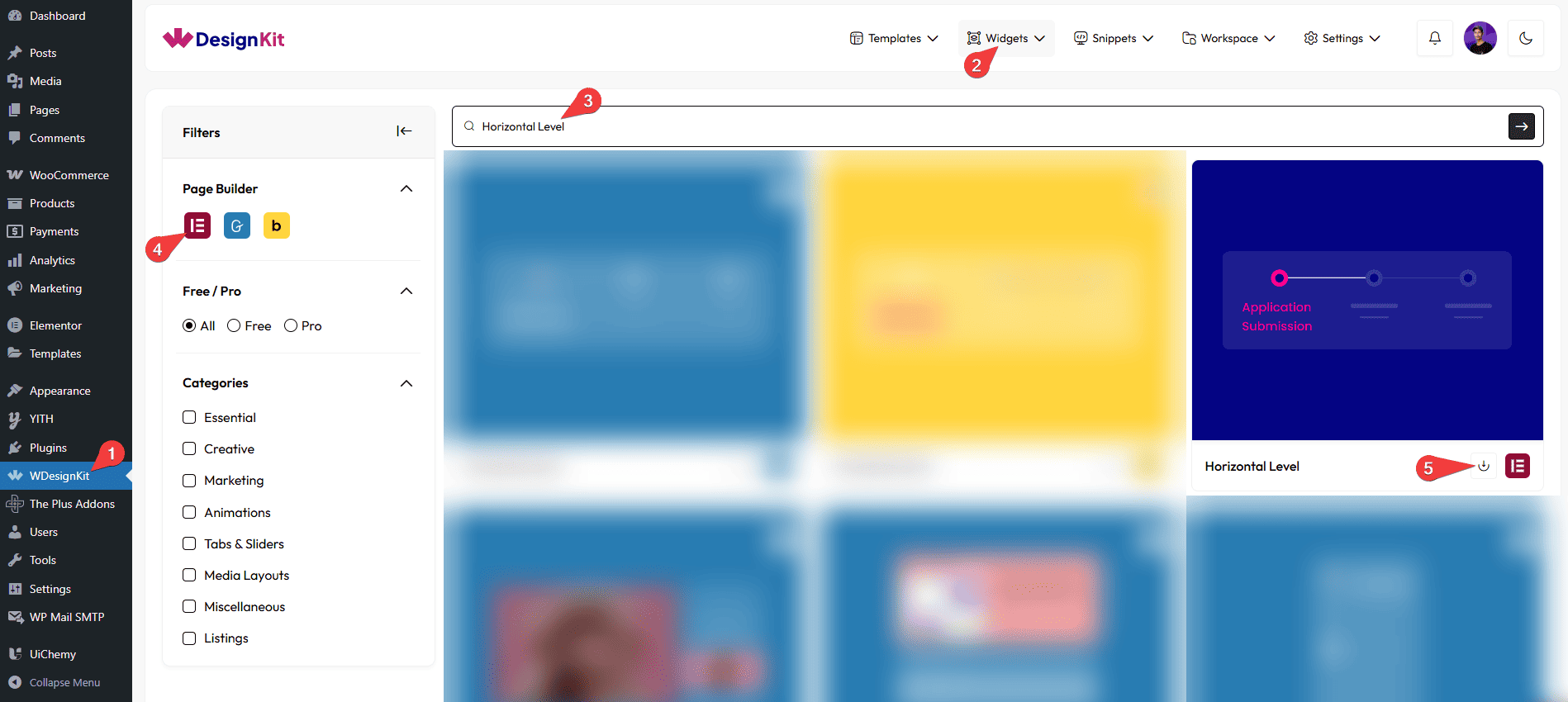
- Activate the Horizontal Level widget from WDesignKit’s Ready Widgets.
- Drag the widget onto the page and pick a circle Style: Dot, Number, or Check Mark.
- Add items under Levels, each with its content type, description, and Active state.
- Set the column count per device from Extra Options, then customize colors from the Style tab.
8. Use Cases
- An order-status or shipping-progress bar shown left to right
- A short onboarding or setup process shown as horizontal steps
9. Limitations
- Active states are set manually per item, the widget does not track real progress or update automatically.
- The circle Style applies to every item at once, individual items cannot mix marker types.
10. Troubleshooting
- Steps wrap awkwardly on mobile: lower the mobile column count in Extra Options so fewer steps sit per row.
- Checkmark does not appear on an item: enable that item’s Active toggle first, Check Mark style only shows once the item is marked Active.
- Icon or image is missing: confirm the Select dropdown for that item is set to Icon or Image and the corresponding field was actually filled in.