
How to Use Select2 Control to Create Multiselect Field?
On this page
What It Does
The Select2 control is a WDesignKit Widget Builder control that lets your custom widget’s end users choose multiple options from a searchable dropdown, instead of a single value. It’s the multiselect equivalent of the plain Select control.
Requirement: This feature is part of the WDesignKit Widget Builder. Make sure WDesignKit is installed and activated. See the full Widget Builder overview for the base workflow this control plugs into.
Why It Matters
A single Select control only lets a user pick one option at a time. Filter widgets, tag pickers, multi-category selectors, and any UI where someone needs to choose several items from a list all need a proper multiselect, and Select2 is how you wire that into a custom Elementor widget without writing your own dropdown component.
What You Get
- A searchable, multi-value dropdown control in the Widget Builder’s Controller panel
- A Drop Down Value table where you define each option’s value and label
- A loop-based HTML pattern so every selected value renders in your widget markup
- A Multiple toggle that switches the control between single-select and multiselect behavior
Benefits
- No custom JS dropdown/multiselect library to wire up yourself
- End users get a familiar, searchable multiselect UI out of the box
- Same control definition works whether you need single or multiple selection: just flip the Multiple toggle
Capabilities
| Field | What it does |
|---|---|
| Value | The unique name inserted into the HTML editor to reference this control’s output |
| Drop Down Value → Value | The underlying value stored for a given dropdown option |
| Drop Down Value → Options | The label shown to the end user for that option |
| +Add | Adds another value/label row to the dropdown |
| Multiple toggle | ON = multiselect (Select2 behavior). OFF = reverts to a normal single-select dropdown |
Required Setup
- WDesignKit plugin installed and activated
- Elementor (the Select2 control is used inside an Elementor-targeted WDesignKit widget)
- A widget already open in the WDesignKit Widget Builder editor
How to Use It
In the Widget Builder, the Select2 control lives under Controls → Data Controls alongside the plain Select control.
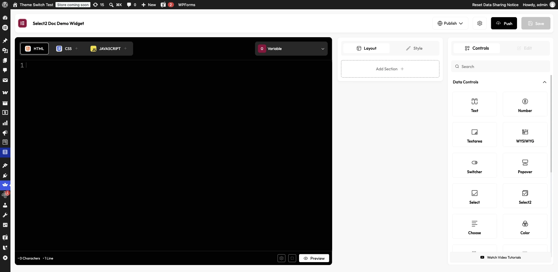
- Drag the Select2 control from the Controls panel into the Layout panel.
- In the right sidebar of the HTML tab, note the control’s unique Value name.
- Because Select2 renders a list of selected values, wrap its output in a loop: click the control’s unique name, then choose Loop from the dropdown. This inserts loop HTML into the editor.
- Remove the placeholder comment inside the loop and click Value from the sidebar to insert the Select2 unique name in its place.
- Select the Select2 control itself, then in Drop Down Value add each option: a Value (stored value) and an Options label. Click +Add for each additional option.
- Keep the Multiple toggle enabled; disabling it turns the control back into a normal single-select dropdown.
- Click Save to save the widget.
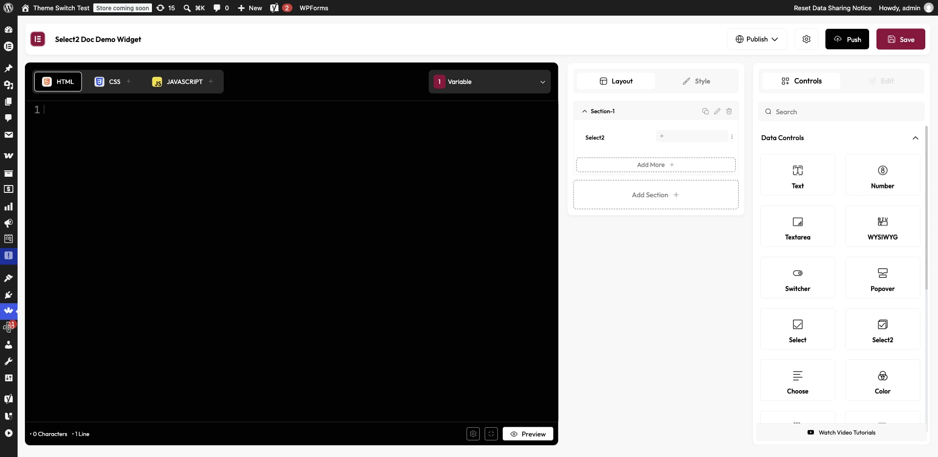
Once saved, dragging the widget onto a page lets end users select multiple values from the dropdown.
Also see How to Use Control Classes to Style UI Elements.
Use Cases
- A category/tag filter widget where a visitor can select several tags at once
- A multi-city or multi-location picker for a custom listing widget
- A settings-style widget where the site owner picks multiple features to display
- Any control that needs a searchable dropdown, even with the Multiple toggle off
Limitations
- Select2’s output must be wrapped in a Loop block to render each selected value, since it isn’t a single-value control like Text or Number.
- Forgetting to keep the Multiple toggle enabled silently turns it into a normal single-select, which can look like a bug if you’re expecting multi-value output.
- Dropdown options are defined manually (Value/Options pairs); there is no built-in dynamic source (e.g. auto-populating from taxonomy terms) for this control specifically.
Troubleshooting
No FluentSupport tickets specifically about the Select2/multiselect control were found at the time of writing.
- Dropdown only lets me pick one value: check that the Multiple toggle is enabled on the Select2 control; it defaults differently than expected if toggled off.
- Selected values don’t appear on the frontend: confirm the Select2 unique name was inserted inside a Loop block, not used as a plain single-value placeholder.
- New dropdown option doesn’t show up: make sure you clicked +Add to commit the row, and that both the Value and Options fields are filled in before saving the widget.