
Sliders Widget for Elementor
On this page
This widget builds an image slider where each slide can carry its own title, description, button, and a small clickable thumbnail used to jump between slides.
1. What It Does
Sliders renders a repeatable list of slides, each with its own image, title, description and optional button, plus a row of thumbnail buttons visitors click to switch slides.
2. Why It Matters
It gives a lightweight, Elementor-native image slider with per-slide content and navigation, without needing a separate slider plugin.
3. What You Get
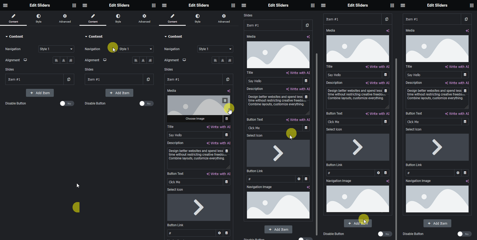
A Slides list (repeater) where each entry has its own image, title, description, button text/icon/URL and a navigation thumbnail image.
4. Benefits
Skipped, already covered above: the value is the lightweight native slider with per-slide content described in Why It Matters, restating it here would not add anything new.
5. Capabilities
- Add, reorder or remove slides in the Slides repeater
- Per-slide image, title, description, button text, icon and URL
- Per-slide navigation thumbnail image, clicked to jump to that slide
- Two layout styles (Style 1 / Style 2)
- Disable Button toggle to hide the per-slide button entirely
- Alignment control for the slide content
6. How It Works
The widget renders each configured slide and a matching thumbnail button underneath. Clicking a thumbnail jumps directly to its slide. Confirmed live via the widget’s JSON config: there is no autoplay or timing setting, the widget does not advance on its own, navigation is manual via the thumbnails only.
7. How to Use It
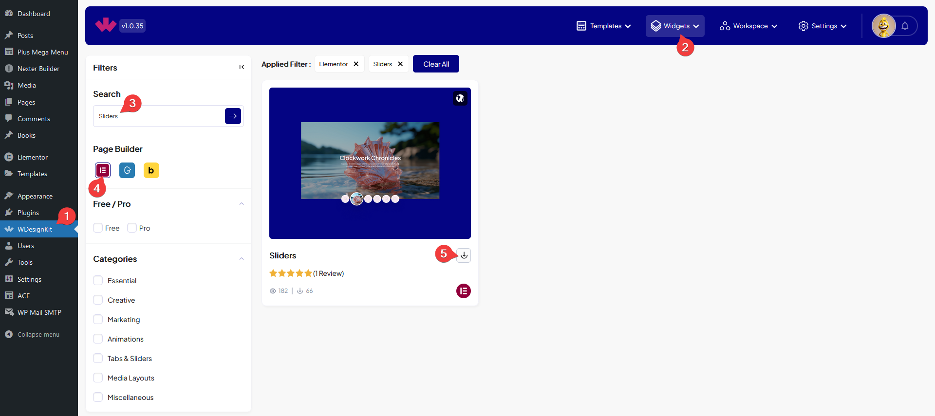
- Activate the Sliders widget from WDesignKit’s Ready Widgets.
- Drag the widget onto the page and, in the Slides repeater, add an image, title, description, button and navigation thumbnail for each slide.
- Pick a layout style, set alignment, and preview on the published page.

8. Use Cases
- A homepage hero rotation where each slide has its own headline and CTA.
- A simple portfolio or product gallery where visitors click thumbnails to browse.
9. Limitations
- There is no autoplay or timing control, confirmed live via the widget’s JSON config, slides only change when a visitor clicks a thumbnail.
- A slide with no navigation thumbnail image set still renders, but has no visible way to jump directly to it other than clicking through the other thumbnails.
- FLAGGED FOR OPERATOR: this widget shipped a “renamed content and style control labels” update since these screenshots were uploaded (screenshots dated 2024, control-label rename shipped as part of version 1.0.1) – the Activate and Content screenshots may show pre-rename Elementor panel labels. New screenshots are recommended.
10. Troubleshooting
- Clicking a thumbnail does nothing: confirm the widget was activated in Ready Widgets before use.
- A slide shows a placeholder image: no image was set in that slide’s Select Image field in the repeater.
- Button does not appear on a slide: check that Disable Button is not turned on for that slide.