
Elementor Header Templates, Free and Ready to Import
Contents
- Table of Contents
- Header Template vs. Header Section: They’re Not the Same Import
- Which Header Tools Need Elementor Pro
- With Elementor Pro
- Without Elementor Pro
- What a Real Header Template Needs
- How to Make an Elementor Header Sticky
- What WDesignKit Ships for Headers and Navigation Today
- Side Sticky Header Menu
- Full Screen Menu
- Mini Hamburger Menu and Toggle Menu
- How to Add a WDesignKit Header Widget to Your Site
- Header Patterns That Match the Site
- Common Header Mistakes to Check Before Launch
- Suggested Reading
- Frequently Asked Questions
- Author
Key Takeaways
- Elementor Pro's Theme Builder treats a header as a site part, so one header template applies site-wide through display conditions or only to specific pages, posts or archives.
- Free Elementor cannot assign a header to the whole site by itself, so Ultimate Addons for Elementor and Hello Plus are the two options named for header building without Elementor Pro.
- A real header template needs an editable menu, tested mobile behavior, sticky or transparent-on-scroll logic, a working CTA or search slot, the correct HTML Tag, and a logo sized for small screens.
- Elementor makes a sticky header with Motion Effects on the parent container, Sticky set to Top, device choices under Sticky On, and Effects Offset set near the header height.
- WDesignKit lists 239 widgets total, including 112 for Elementor, and its header and menu results include Side Sticky Header Menu, Full Screen Menu, Mini Hamburger Menu, Toggle Menu and Side Off Canvas Menu.
Table of Contents
A header is the one section that loads on every page of a site. If it breaks on mobile, every page breaks on mobile. If its menu is hardcoded, every new page means another manual edit. That is why a header deserves more care than a hero section, and why grabbing the first free header template you find goes wrong more often than people expect.
This guide covers what an Elementor header template actually is, which parts need Elementor Pro and which do not, how to make a header sticky with Elementor’s own settings, and what WDesignKit ships today for headers and navigation across Elementor and Bricks. Every WDesignKit count below was pulled live from its marketplace on 14 September 2026, so you are reading what exists rather than what a sales page implies.
Header Template vs. Header Section: They’re Not the Same Import
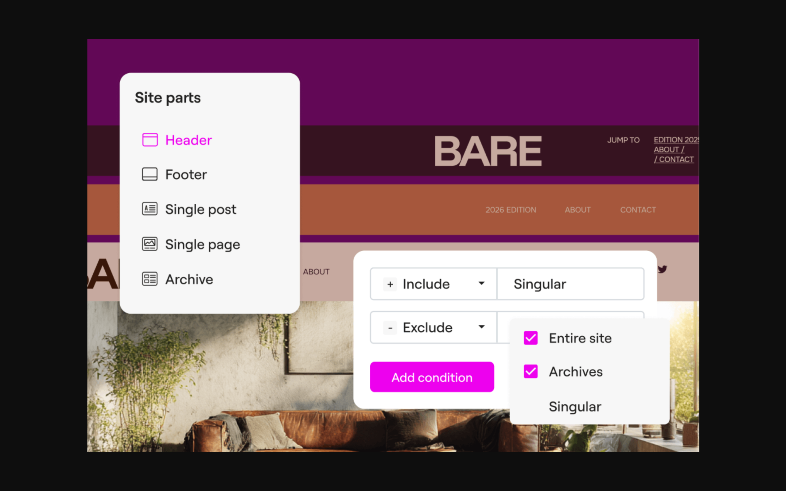
Elementor Pro’s Theme Builder treats a header as a site part: a global template with display conditions, so it can apply to the entire site or only to specific pages, posts or archives. A header section from a general template library is a different thing. It is a static layout dropped into one page’s content, it does not attach to Theme Builder’s conditional logic, and it will not appear on any other page on its own.
If a downloaded header only shows up on the page you pasted it into, that is the difference you are running into, not a bug. The fix is to create a proper Header template in Theme Builder, build or paste the design inside it, and then set the display conditions so it renders everywhere it should.
There is a third category worth naming, because it is where most of the real flexibility lives: header widgets. These are single components, such as a hamburger menu, a full screen overlay menu or a sticky side menu, that you place inside a header template. Most of what WDesignKit ships for headers falls into this category, and it is covered in detail further down.
Which Header Tools Need Elementor Pro
Elementor’s own Pro vs. Free comparison lists the Theme Builder, which covers headers, footers, post templates and archive templates, as a Pro feature. Elementor’s homepage describes the same split: you can start with the no-cost Editor tier and upgrade to Editor Pro when you need advanced capabilities such as the Theme Builder. At the time of writing, Elementor’s pricing page lists the Essential plan at $49 a year for one website, and that plan includes Theme Builder.
With Elementor Pro
Elementor’s header documentation describes the flow: open Theme Builder from the Elementor menu in wp-admin, click the plus sign on the Header card, optionally choose a pre-designed header from the Template Library, design it in the editor, then publish and choose the pages where it should appear. This is the cleanest route, because the header lives in one place and every change updates the whole site at once.
Without Elementor Pro
Free Elementor cannot assign a header to the whole site by itself, so you need a companion plugin. Two options are worth knowing. Ultimate Addons for Elementor, whose listing includes a Header Footer Builder, has more than 2,000,000 active installs on WordPress.org. Hello Plus, a free plugin from Elementor, adds Hello widgets including a Header and a Footer plus a header and footer templates library, but it requires one of Elementor’s Hello themes, such as Hello Biz. If your site is not already on a Hello theme, the first option is usually the less disruptive one.
Also Read: Best Free Elementor Templates in 2026 (Tested) for full-page layouts that work without paid add-ons.
What a Real Header Template Needs
- A menu you can update in one place. A hardcoded list of links means editing the header every time a page is added or renamed.
- Mobile behaviour tested on real widths. A hamburger menu that opens and closes cleanly on an actual phone, not just in the editor’s responsive preview.
- Sticky or transparent-on-scroll logic that does not fight the theme’s own header styling underneath it.
- A CTA or search slot that works. A button wired to a real form, booking page or search widget, not a decorative placeholder.
- The correct HTML tag. Elementor’s header settings include an HTML Tag option, and setting it to header identifies the section to screen readers. It takes seconds and it is easy to forget.
- A logo sized for small screens. A logo that looks balanced at desktop width often pushes the menu icon off the edge on a narrow phone.
Most free header layouts get the first point right and skip the rest. When you evaluate a header template, run through this list before you judge how it looks, because a good-looking header that fails on mobile costs more to fix than a plain one that works.
How to Make an Elementor Header Sticky
Sticky headers keep navigation visible while visitors scroll. Elementor handles this with Motion Effects on the header’s container. These steps follow Elementor’s sticky header documentation, last updated 9 August 2026:
- Open the Header template in the Elementor editor.
- Select the header’s parent container, either by clicking its handle or by selecting it in the Structure window.
- Click the Advanced tab and expand Motion Effects.
- In the Sticky dropdown, choose Top. None removes the effect, and Bottom is not meant for headers.
- Under Sticky On, pick the devices where it should apply: Desktop, Tablet Portrait and Mobile Portrait.
- Set Offset, which pushes the sticky element up or down by pixels, and Effects Offset, which is how many pixels a visitor scrolls before the sticky effect starts.
- Set Anchor offset so content stays visible under the sticky header when a visitor jumps to an anchor link, then click Publish.
One detail in Elementor’s documentation catches people who still build with sections instead of containers: the stretch section feature has to be deactivated before the scrolling effect options appear. And a practical habit worth adopting: set Effects Offset to roughly the height of your header, so the sticky behaviour starts only once the original header has scrolled out of view.
What WDesignKit Ships for Headers and Navigation Today
WDesignKit is a template and widget library that runs inside Elementor, Gutenberg and Bricks. Its marketplace currently lists 239 widgets: 112 for Elementor, 36 for Gutenberg and 91 for Bricks. Searching that marketplace for “header” returns four results, and searching for “menu” returns a wider set of navigation widgets. These are the ones that matter when you are building a header:
| Widget | Builders | Tier | Where it fits |
|---|---|---|---|
| Side Sticky Header Menu | Elementor, Bricks | Pro | Long-scroll and content-heavy pages |
| Mini Hamburger Menu | Elementor, Bricks | Free | Compact mobile navigation |
| Toggle Menu | Elementor, Bricks | Free | Simple show and hide navigation |
| Full Screen Menu | Elementor | Free | Portfolios, agencies and landing pages |
| Flip Card Menu | Elementor, Bricks, Nexter Blocks | Free | Visual menus with a card flip effect |
| Hover Smooth Side Menu | Elementor, Bricks | Pro | Minimal and creative layouts |
| Side Off Canvas Menu | Elementor | Pro | Slide-in navigation panels |
None of these is a one-click full header template in the way a landing page kit is. They are components you drop into your own header template, and that is the accurate way to describe them. If you want a complete header already designed, the full-page kits in the WDesignKit template library include header sections as part of each page, which you can copy into a Theme Builder header.
Side Sticky Header Menu
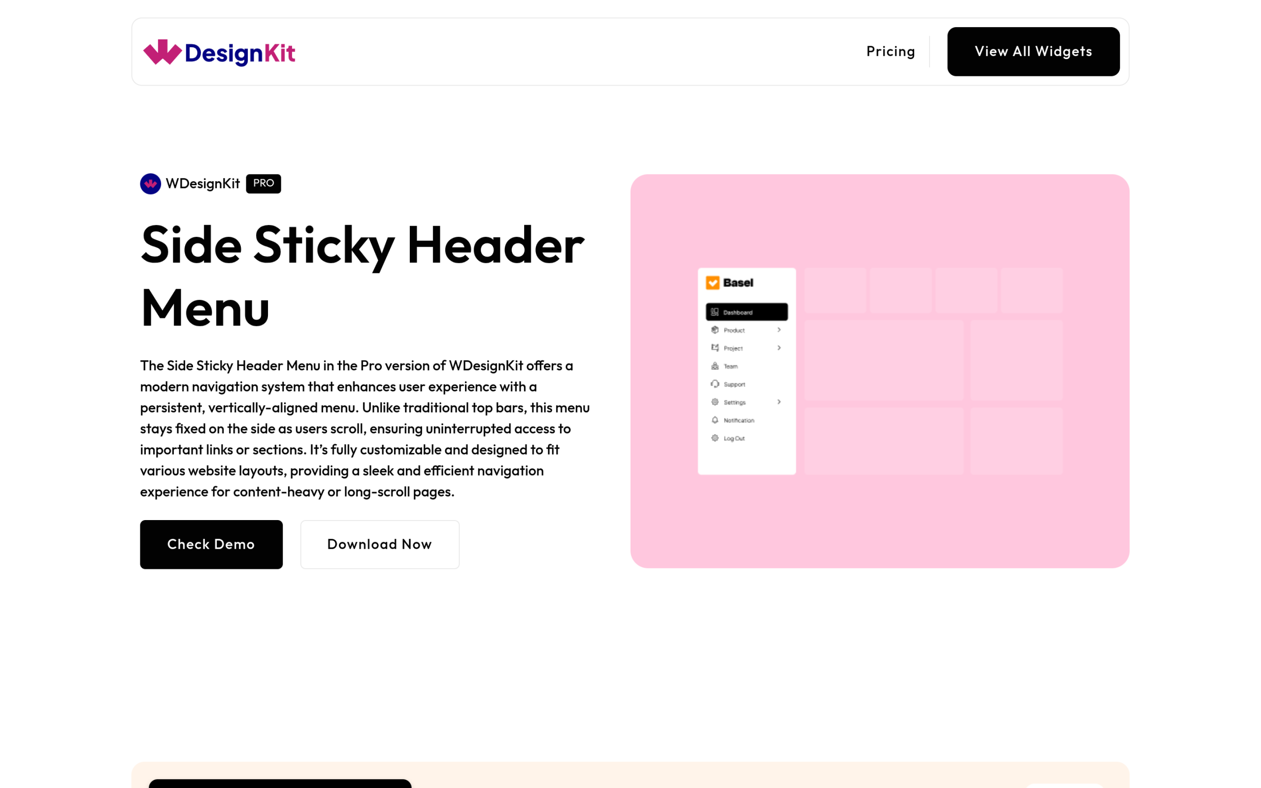
The Pro Side Sticky Header Menu is a vertical navigation that stays fixed at the side of the screen as visitors scroll. WDesignKit’s widget page positions it for content-heavy and long-scroll pages, where a traditional top bar disappears the moment someone starts reading. It suits documentation hubs, dashboards and long service pages better than a standard top header does.
Full Screen Menu
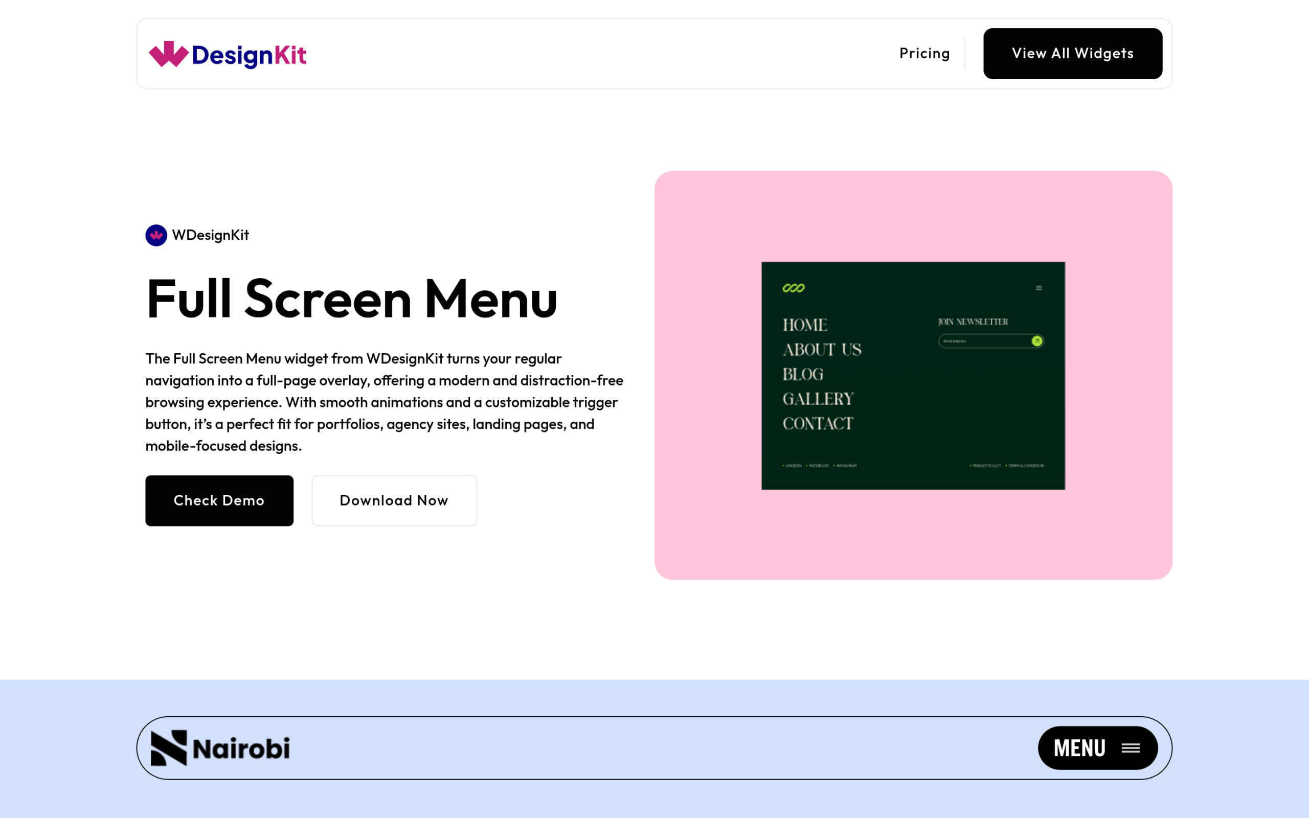
The free Full Screen Menu turns navigation into a full-page overlay with animation and a customizable trigger button. WDesignKit’s widget page recommends it for portfolios, agency sites, landing pages and mobile-focused designs. It is also one of the most downloaded navigation widgets in the marketplace, with more than 1,100 downloads on its Elementor listing, which is a reasonable signal that it holds up in real builds.
Mini Hamburger Menu and Toggle Menu
Both are free and both solve the most common header problem: a clean mobile menu. The Mini Hamburger Menu is a compact toggle that keeps the header uncluttered on small screens, and the Toggle Menu is a simple show and hide navigation with close to 1,100 downloads on its Elementor listing. Each also has a Bricks version, so a team that builds on both platforms can keep the same navigation pattern across client sites.
Also Read: Elementor Landing Page Templates: Free Kits to Launch Your Site Faster for full-page kits that include their own header sections.
How to Add a WDesignKit Header Widget to Your Site
- Install and activate the free WDesignKit plugin alongside Elementor. You need Elementor Pro, or one of the free header builders mentioned above, to assign the header site-wide.
- Open the Widget section of the WDesignKit plugin and go to Browse Widgets. Search for “menu” or “header” and filter by your builder.
- Download the widget you want. Downloaded widgets install into your local WDesignKit widget library and then appear in the Elementor widget panel like any other widget. Pro widgets need an active WDesignKit Pro plan.
- Open your Header template in Theme Builder, drag the widget into the header container, and set the template’s display condition to Entire Site.
- Replace the demo links with your real page URLs, check how the widget stores its links so you know how to update them later, and style it to match your global colours and fonts.
- Preview at 375px and 768px widths before publishing. Most header regressions only show up at those two breakpoints.
If you build the same header for several clients, save the finished header to your WDesignKit Cloud Workspace. The workspace stores templates and custom widgets against your account, so you can pull the same header into the next site instead of rebuilding it, and share it with teammates.
Header Patterns That Match the Site
The right header depends less on style and more on what visitors come to do. This is a useful starting point when you pick a pattern:
| Site type | Header pattern | Components to reach for |
|---|---|---|
| Local business or service | Top bar with logo, four to six links and a phone or booking button | A standard menu on desktop, Toggle Menu or Mini Hamburger Menu on mobile |
| Portfolio or agency | Minimal logo bar with a single menu trigger | Full Screen Menu |
| Documentation, SaaS or long guides | Persistent side navigation | Side Sticky Header Menu |
| WooCommerce store | Logo, search, account link and cart | Elementor Pro’s Menu Cart widget plus a compact mobile menu |
| Blog or publication | Logo, category links and search | A sticky top bar with a short Effects Offset |
The Menu Cart widget in that table is part of Elementor’s WooCommerce Builder, which opens the cart in a window so shoppers can check it from any page without leaving it. It requires Elementor Pro and WooCommerce.
Common Header Mistakes to Check Before Launch
- A display condition left on one page. The header looks finished in the editor and is missing everywhere else.
- Two headers on the same page. Check that your theme’s own header is not rendering above the new Theme Builder header.
- A sticky header covering anchor targets. Set Anchor offset so jump links do not land underneath the header.
- A transparent header over a light hero. White menu text on a pale image is unreadable, so test it against every hero image you use.
- An oversized logo file. A 2,000 pixel logo loads on every page view, so export it at the size it is displayed.
- A menu tested only in the editor. Open the live site on a real phone and tap every item, including dropdowns.
None of these take long to check, and all of them are visible to every visitor on every page, which is exactly why the header is worth a final pass of its own before launch.
Also Read: Elementor Blog Templates: Free Layouts for Content Sites if your header also needs category navigation and search for a content-heavy site.
Suggested Reading
- Elementor Landing Page Templates: Free Kits to Launch Your Site Faster
- Elementor Blog Templates: Free Layouts for Content Sites
- Introducing the WDesignKit Widget Builder
- Best Free Elementor Templates in 2026 (Tested)
Frequently Asked Questions
Why does a header template show up only on one page in Elementor?
That usually means you imported a header section, not a real Theme Builder header template. A section is just static content inside one page, while a header template is a site part with display conditions that can apply across the whole site or specific pages, posts, or archives. WDesignKit Learning Center points out that this difference is the main reason downloaded headers seem to work in the editor but not site-wide.
Do I need Elementor Pro to build a site-wide header?
Elementor Pro is the cleanest route because Theme Builder is a Pro feature and it handles headers, footers, post templates, and archive templates. Elementor’s own flow is to build the header in Theme Builder, publish it, and set display conditions so it appears where needed. Without Pro, you need a companion plugin such as Ultimate Addons for Elementor or Hello Plus to assign a header site-wide.
What should a real Elementor header template include?
A usable header needs more than a logo and links. The page calls out five things that matter in practice: one menu you can update in one place, mobile behavior tested at real widths, sticky or transparent-on-scroll logic that does not clash with the theme, a working CTA or search slot, and the correct HTML tag. WDesignKit Learning Center also notes that setting the HTML Tag to header helps screen readers.
How do I make an Elementor sticky header behave properly on mobile?
Sticky headers work best when the scroll trigger matches the actual height of the bar. Elementor uses Motion Effects on the parent container, with Sticky set to Top and device targeting under Sticky On for Desktop, Tablet Portrait, and Mobile Portrait. The useful gotcha is Effects Offset: setting it roughly to the height of your header keeps sticky behavior from kicking in too early and hiding content under anchor jumps.
Which WDesignKit menu widget fits a long-scroll or mobile-heavy site?
The Side Sticky Header Menu is the strongest match for long-scroll pages because it stays fixed at the side of the screen while visitors read. WDesignKit Learning Center positions it for documentation hubs, dashboards, and long service pages where a top bar disappears too fast. For compact mobile navigation, the Mini Hamburger Menu or Toggle Menu makes more sense because they keep the header uncluttered.
Last reviewed: September 14, 2026
Author

Sagar is the Founder & CEO of POSIMYTH Innovations, with 10+ years building WordPress products trusted by 100,000+ websites globally. He has led the development of The Plus Addons for Elementor, Nexter, WDesignKit, and UiChemy, all built hands-on from concept to launch. His work focuses on making website building faster, more flexible, and accessible for creators and businesses worldwide.
Keep reading
Elementor WooCommerce Templates: Free Store Page Layouts
Elementor WooCommerce templates explained: which store pages need Elementor Pro’s WooCommerce Builder, why checkout matters most, and where WDesignKit fits.
13 min read
AI Website Builder for WordPress: What It Actually Means
AI website builder for WordPress explained: hosted builders, AI inside templates, and AI agents via MCP, plus where WDesignKit’s AI kit import and MCP fit.
13 min read
Elementor Blog Templates: Free Layouts for Content Sites
Elementor blog templates that work: single post and archive templates, Loop Grid vs Posts widget, the free block editor route and WDesignKit blog widgets.
12 min read